pacman::p_load(sf, tidyverse, tmap, spdep, funModeling, purrr, here)Take Home Ex-1
Overview
Step 1: Load the required Packages
sf : Simple features for R. We import this package to help us read the aspatial and geospatial data.
tidyverse: This package help us to transform and better present the data.
tmap: We use this package to plot thematic maps
spdep: We use this package to help us obtain the spatial weights.
funModeling: We use this package to help us with EDA
here: Helps us generate a path to a specific directory on the root
Load the packages:
Step 2: Import the Data
Import Nigeria water point data-file:
Generate a path:
We use the here function to generate a specific file path on the root folder.
shapefile_path <- here("data", "dataNigeria", "geospatial")
shapefile_path[1] "D:/f4sared/ISSS624/data/dataNigeria/geospatial"Some useful link for the CRS:
st_read() belongs to the sf package. It reads simple features from file or database. Simple features or simple feature access refers to formal standard ISO 19125-1:2004 that describes how real world data can be represented in computers, with emphasis on the spatial geometry of these objects. Link below:
To find the CRS of the shapefile, open the .prj file as a text. It will tell you which projection system is being used.
Read the shapefile using st_read() belonging to the sf package:
The data read will be saved as a simple feature data table.
We will use the filter() function of dplyr package to filter only rows for Nigeria
# wp <- st_read(
# dsn = shapefile_path,
# layer = "geo_export",
# crs = 4326) %>%
# filter(clean_coun == "Nigeria")Generate the save path using here function:
savefile_path <- here("data", "dataNigeria", "geospatial", "wp_nga.rds")
savefile_path[1] "D:/f4sared/ISSS624/data/dataNigeria/geospatial/wp_nga.rds"We will next save the file using write_rds() of the tidyverse package:
rds is a native data format of R.
# wp_ng <- write_rds(wp, savefile_path)Import Nigeria geo-boundary file:
Next we will make the path to the geo boundary file:
shapefile_path <- here("data", "dataNigeria", "boundary")
shapefile_path[1] "D:/f4sared/ISSS624/data/dataNigeria/boundary"Next we will Import the Nigeria LGA Boundary Data with st_read() function:
The imported data will be saved as a simple features dataset.
nga <- st_read(
dsn = shapefile_path,
layer = "geoBoundaries-NGA-ADM2",
crs = 4326)Reading layer `geoBoundaries-NGA-ADM2' from data source
`D:\f4sared\ISSS624\data\dataNigeria\boundary' using driver `ESRI Shapefile'
Simple feature collection with 774 features and 5 fields
Geometry type: MULTIPOLYGON
Dimension: XY
Bounding box: xmin: 2.668534 ymin: 4.273007 xmax: 14.67882 ymax: 13.89442
Geodetic CRS: WGS 84Downsize further the wp_nga data:
Load the previously saved data:
We will select specific columns using select().
# final <- read_rds(rdsfile_path) %>% select(1:2, 14:17, 23)Create the path for saving the file
# savefile_path <- here("data", "dataNigeria", "geospatial", "wp_nga_v2.rds")
# savefile_pathSave the file:
# write_rds(final, savefile_path)Step 3: Data wrangling
Visualize Initial distribution
Generate path to rds file saved previously:
rdsfile_path <- here("data", "dataNigeria", "geospatial","wp_nga_v2.rds")
rdsfile_path[1] "D:/f4sared/ISSS624/data/dataNigeria/geospatial/wp_nga_v2.rds"Load the rds file with read_rds() function of the tidyverse package:
We will also make use of the piping to replace the “na” values with “unknown”.
mutate() is a function of the dplyr package.
wp_nga <- read_rds(rdsfile_path) %>%
mutate(status_cle = replace_na(status_cle, "Unknown"))Check the CRS of the spatial datafile with st_crs():
st_crs(wp_nga)Coordinate Reference System:
User input: EPSG:4326
wkt:
GEOGCRS["WGS 84",
DATUM["World Geodetic System 1984",
ELLIPSOID["WGS 84",6378137,298.257223563,
LENGTHUNIT["metre",1]]],
PRIMEM["Greenwich",0,
ANGLEUNIT["degree",0.0174532925199433]],
CS[ellipsoidal,2],
AXIS["geodetic latitude (Lat)",north,
ORDER[1],
ANGLEUNIT["degree",0.0174532925199433]],
AXIS["geodetic longitude (Lon)",east,
ORDER[2],
ANGLEUNIT["degree",0.0174532925199433]],
USAGE[
SCOPE["Horizontal component of 3D system."],
AREA["World."],
BBOX[-90,-180,90,180]],
ID["EPSG",4326]]Use the freq() of the funModeling package to show the distribution percentage of status_cle:
freq(data=wp_nga,
input = 'status_cle')Warning: The `<scale>` argument of `guides()` cannot be `FALSE`. Use "none" instead as
of ggplot2 3.3.4.
ℹ The deprecated feature was likely used in the funModeling package.
Please report the issue at <https://github.com/pablo14/funModeling/issues>.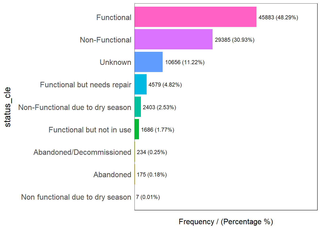
status_cle frequency percentage cumulative_perc
1 Functional 45883 48.29 48.29
2 Non-Functional 29385 30.93 79.22
3 Unknown 10656 11.22 90.44
4 Functional but needs repair 4579 4.82 95.26
5 Non-Functional due to dry season 2403 2.53 97.79
6 Functional but not in use 1686 1.77 99.56
7 Abandoned/Decommissioned 234 0.25 99.81
8 Abandoned 175 0.18 99.99
9 Non functional due to dry season 7 0.01 100.00Filter for functional water-points:
Here we will use the filter() function from the dplyr package to select “functional” rows only:
We use the %in% to denote the membership in the group of strings.
wpt_functional <- wp_nga %>%
filter(status_cle %in%
c("Functional",
"Functional but not in use",
"Functional but needs repair"))Then we will plot with freq() function from funModeling to show the distribution:
freq(data=wpt_functional,
input = 'status_cle')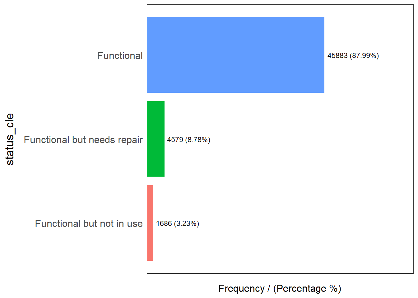
status_cle frequency percentage cumulative_perc
1 Functional 45883 87.99 87.99
2 Functional but needs repair 4579 8.78 96.77
3 Functional but not in use 1686 3.23 100.00Filter for non-functional
Filter for non-functional rows:
Use %in% for to select rows that fall into the specific categories.
wpt_nonfunctional <- wp_nga %>%
filter(status_cle %in%
c("Abandoned/Decommissioned",
"Abandoned",
"Non-Functional",
"Non functional due to dry season",
"Non-Functional due to dry season"))Plot the distribution with the freq() function:
freq(data=wpt_nonfunctional,
input = 'status_cle')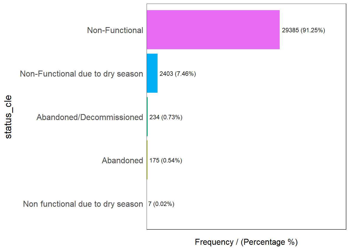
status_cle frequency percentage cumulative_perc
1 Non-Functional 29385 91.25 91.25
2 Non-Functional due to dry season 2403 7.46 98.71
3 Abandoned/Decommissioned 234 0.73 99.44
4 Abandoned 175 0.54 99.98
5 Non functional due to dry season 7 0.02 100.00Filter for unknown:
Lastly we filter for the rows that have unknown status:
wpt_unknown <- wp_nga %>%
filter(status_cle == "Unknown")Perform data manipulation (Point-In-Polygon):
Using st_intersects, we will be able to create a list of rows from wp_nga that intersects each row of nga.
For the intersection to work, st_intersect will check if each point falls within the polygon of nga.
Next we use the lengths() function to count the number of instances. Then we append to a new column.
We repeat this step across all 3 categories of Functional, Non-Functional & Unknown:
nga_wp <- nga %>%
mutate(`total wpt` = lengths(
st_intersects(nga, wp_nga))) %>%
mutate(`wpt functional` = lengths(
st_intersects(nga, wpt_functional))) %>%
mutate(`wpt non-functional` = lengths(
st_intersects(nga, wpt_nonfunctional))) %>%
mutate(`wpt unknown` = lengths(
st_intersects(nga, wpt_unknown)))Next, using the mutate() function of dplyr, we will create 2 new columns:
pct_functional = `wpt functional`/`total wpt`
pct_non-functional = `wpt non-functional`/`total wpt`
We will then use select() of dplyr to retain the fields that we require.
nga_wp <- nga_wp %>%
mutate(pct_functional = `wpt functional`/`total wpt`) %>%
mutate(`pct_non-functional` = `wpt non-functional`/`total wpt`) We will then create a save file path:
savefile_path <- here("data", "dataNigeria", "geospatial", "nga_wp.rds")
savefile_path[1] "D:/f4sared/ISSS624/data/dataNigeria/geospatial/nga_wp.rds"Next we will save this final dataframe using write_rds() of tidyverse package:
write_rds(nga_wp, savefile_path)Step 4: Plot distribution of water point types
Plot the distribution of the water points using qtm() package of tmap:
Here we will add the additional settings to better adjust the size of the legend.
This is done via the tm_layout() function.
nga_wp <- read_rds(savefile_path)
total <- qtm(nga_wp, fill = "total wpt") +
tm_layout(legend.height = 0.4,legend.width = 0.4)
wp_functional <- qtm(nga_wp, fill = "wpt functional") +
tm_layout(legend.height = 0.4,legend.width = 0.4)
wp_nonfunctional <- qtm(nga_wp, fill = "wpt non-functional") +
tm_layout(legend.height = 0.4,legend.width = 0.4)
unknown <- qtm(nga_wp, fill = "wpt unknown") +
tm_layout(legend.height = 0.4,legend.width = 0.4)
tmap_arrange(total, wp_functional, wp_nonfunctional, unknown, asp=2, ncol=2)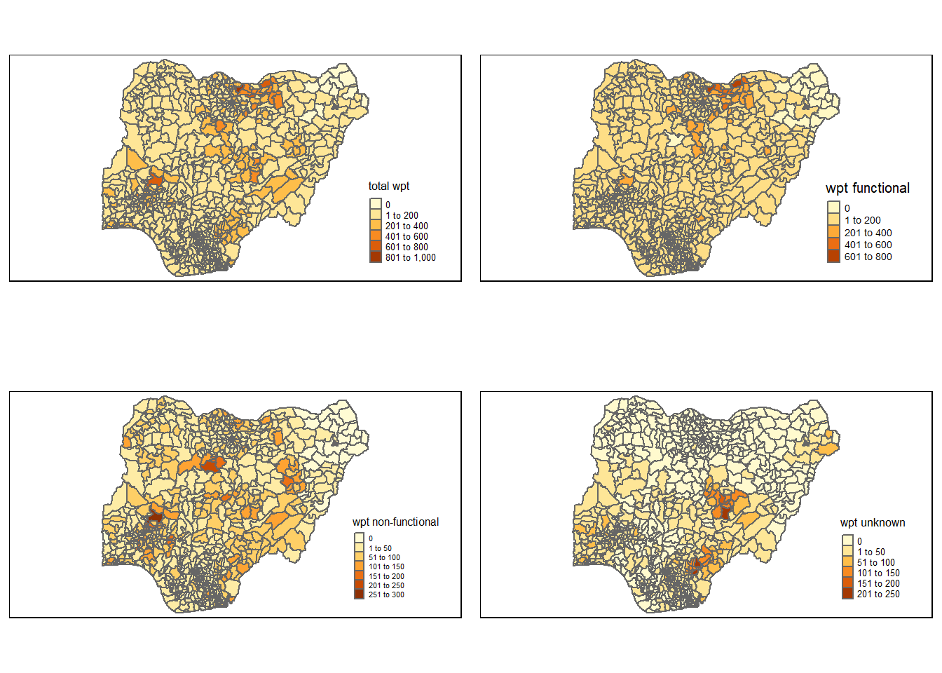
Step 5: Transform to EPSG 26391
We will use the st_crs() function to check the current EPSG of the sf datafile:
st_crs(nga_wp)Coordinate Reference System:
User input: EPSG:4326
wkt:
GEOGCRS["WGS 84",
ENSEMBLE["World Geodetic System 1984 ensemble",
MEMBER["World Geodetic System 1984 (Transit)"],
MEMBER["World Geodetic System 1984 (G730)"],
MEMBER["World Geodetic System 1984 (G873)"],
MEMBER["World Geodetic System 1984 (G1150)"],
MEMBER["World Geodetic System 1984 (G1674)"],
MEMBER["World Geodetic System 1984 (G1762)"],
MEMBER["World Geodetic System 1984 (G2139)"],
ELLIPSOID["WGS 84",6378137,298.257223563,
LENGTHUNIT["metre",1]],
ENSEMBLEACCURACY[2.0]],
PRIMEM["Greenwich",0,
ANGLEUNIT["degree",0.0174532925199433]],
CS[ellipsoidal,2],
AXIS["geodetic latitude (Lat)",north,
ORDER[1],
ANGLEUNIT["degree",0.0174532925199433]],
AXIS["geodetic longitude (Lon)",east,
ORDER[2],
ANGLEUNIT["degree",0.0174532925199433]],
USAGE[
SCOPE["Horizontal component of 3D system."],
AREA["World."],
BBOX[-90,-180,90,180]],
ID["EPSG",4326]]Next, we will use st_transform() to project to the new crs 26391:
nga_wp_26391 <- st_transform(nga_wp, crs = 26391)We then check the new CRS:
st_crs(nga_wp_26391)Coordinate Reference System:
User input: EPSG:26391
wkt:
PROJCRS["Minna / Nigeria West Belt",
BASEGEOGCRS["Minna",
DATUM["Minna",
ELLIPSOID["Clarke 1880 (RGS)",6378249.145,293.465,
LENGTHUNIT["metre",1]]],
PRIMEM["Greenwich",0,
ANGLEUNIT["degree",0.0174532925199433]],
ID["EPSG",4263]],
CONVERSION["Nigeria West Belt",
METHOD["Transverse Mercator",
ID["EPSG",9807]],
PARAMETER["Latitude of natural origin",4,
ANGLEUNIT["degree",0.0174532925199433],
ID["EPSG",8801]],
PARAMETER["Longitude of natural origin",4.5,
ANGLEUNIT["degree",0.0174532925199433],
ID["EPSG",8802]],
PARAMETER["Scale factor at natural origin",0.99975,
SCALEUNIT["unity",1],
ID["EPSG",8805]],
PARAMETER["False easting",230738.26,
LENGTHUNIT["metre",1],
ID["EPSG",8806]],
PARAMETER["False northing",0,
LENGTHUNIT["metre",1],
ID["EPSG",8807]]],
CS[Cartesian,2],
AXIS["(E)",east,
ORDER[1],
LENGTHUNIT["metre",1]],
AXIS["(N)",north,
ORDER[2],
LENGTHUNIT["metre",1]],
USAGE[
SCOPE["Engineering survey, topographic mapping."],
AREA["Nigeria - onshore west of 6°30'E, onshore and offshore shelf."],
BBOX[3.57,2.69,13.9,6.5]],
ID["EPSG",26391]]Once again, we will plot the map to check if everything has been projected correctly:
total <- qtm(nga_wp_26391, fill = "total wpt") +
tm_layout(legend.height = 0.4,legend.width = 0.4)
wp_functional <- qtm(nga_wp_26391, fill = "wpt functional") +
tm_layout(legend.height = 0.4,legend.width = 0.4)
wp_nonfunctional <- qtm(nga_wp_26391, fill = "wpt non-functional") +
tm_layout(legend.height = 0.4,legend.width = 0.4)
unknown <- qtm(nga_wp_26391, fill = "wpt unknown") +
tm_layout(legend.height = 0.4,legend.width = 0.4)
tmap_arrange(total, wp_functional, wp_nonfunctional, unknown, asp=2, ncol=2)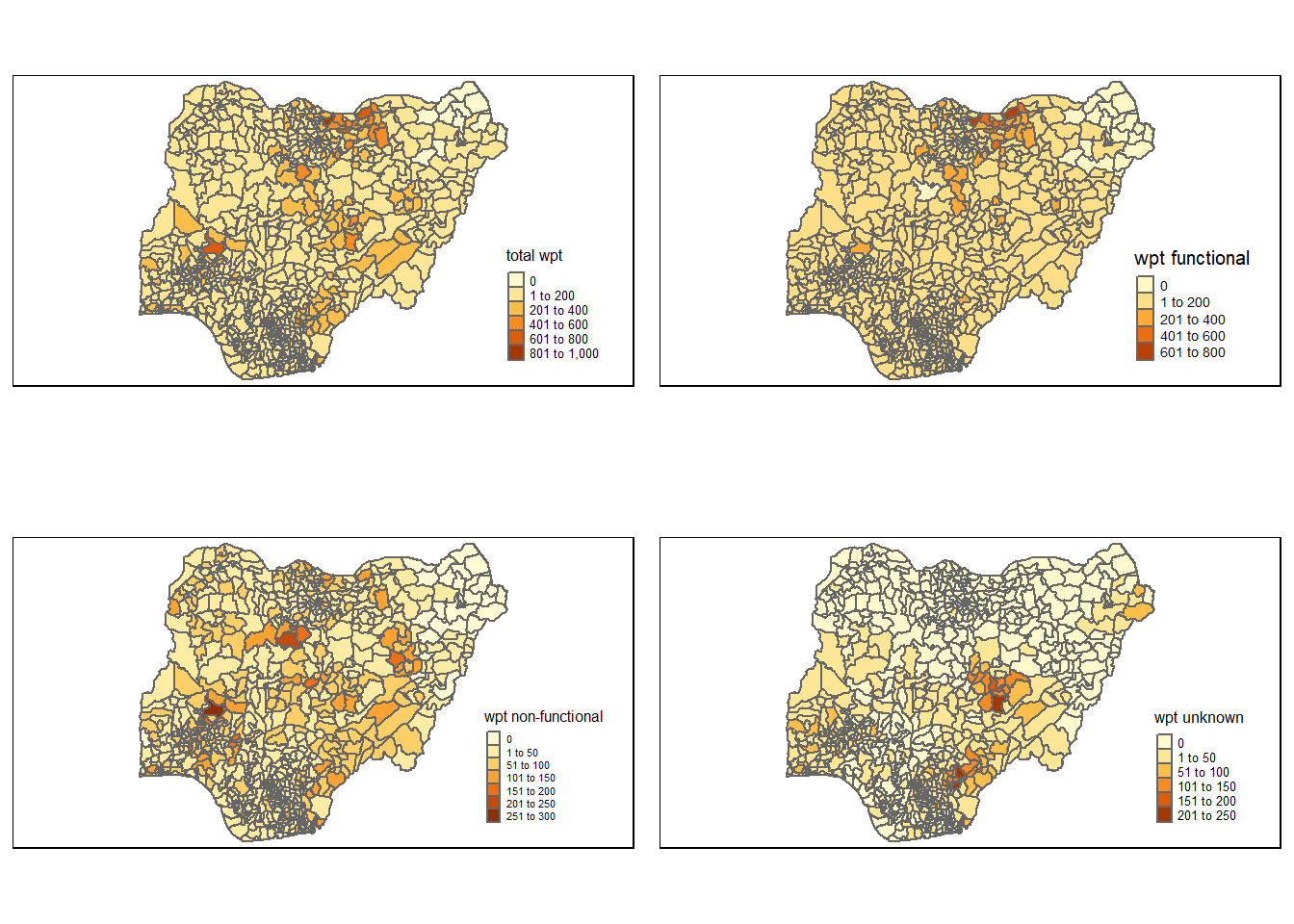
Step 6: Thematic mapping with qtm() & tmap()
Plotting with qtm()
Set the tmap mode to “view” for interactive mode. Else set to “plot”.
qtm() represents quick plotting with tmap package:
tmap_mode("plot")tmap mode set to plottingqtm(nga_wp_26391,
fill = "wpt non-functional")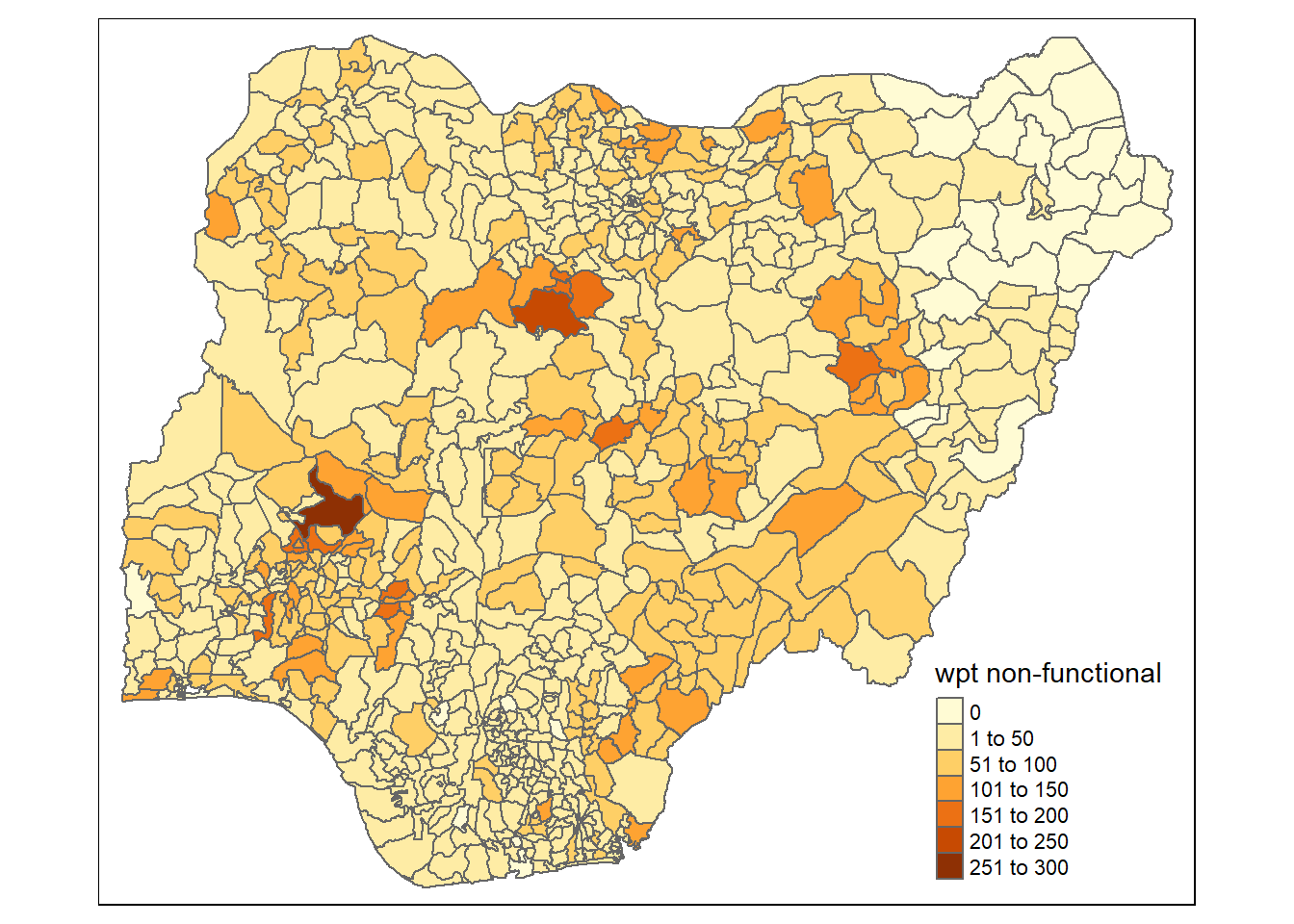
Plotting with tmap()
Jenks:
Jenks: Identify groups with similar values and maximizes the difference between them.
Using interactive tmap(), we will plot using “jenks” classification:
tmap_mode("view")tmap mode set to interactive viewingtm_shape(nga_wp_26391)+
tm_fill(c("wpt non-functional", "wpt functional"),
style = "jenks") +
tm_borders(alpha = 0.5) +
tmap_style("white")tmap style set to "white"other available styles are: "gray", "natural", "cobalt", "col_blind", "albatross", "beaver", "bw", "classic", "watercolor" Using the “jenks” style, we are able to identify visually some areas with high value already.
Quantile:
Splits variables in quantiles, Consequently there are same number of observations in each interval.
Using interactive tmap(), we will plot using “quantile” classification:
tm_shape(nga_wp_26391)+
tm_fill(c("wpt non-functional", "wpt functional"),
style = "quantile") +
tm_borders(alpha = 0.5) +
tmap_style("white")tmap style set to "white"other available styles are: "gray", "natural", "cobalt", "col_blind", "albatross", "beaver", "bw", "classic", "watercolor" When using “quantile” style, we observed a surge in the darker area. Having a closer look at the quantile, we can see that the last quantile has a much bigger band, this mean that quantile may not be too suitable.
Equal:
We will then consider an alternative “equal”:
tm_shape(nga_wp_26391)+
tm_fill(c("wpt non-functional", "wpt functional"),
style = "equal") +
tm_borders(alpha = 0.5) +
tmap_style("white")tmap style set to "white"other available styles are: "gray", "natural", "cobalt", "col_blind", "albatross", "beaver", "bw", "classic", "watercolor" This distribution above matches that of the “jenks” style. We can spot similar patterns on the plot.
We will use bbox to get better visuals:
https://stackoverflow.com/questions/60892033/how-do-you-position-the-title-and-legend-in-tmap
tmap_mode("plot")tmap mode set to plotting# make some bbox magic
bbox_new <- st_bbox(nga_wp_26391)
xrange <- bbox_new$xmax - bbox_new$xmin # range of x values
yrange <- bbox_new$ymax - bbox_new$ymin # range of y values
# bbox_new[1] <- bbox_new[1] - (0.25 * xrange) # xmin - left
bbox_new[3] <- bbox_new[3] + (0.75 * xrange) # xmax - right
# bbox_new[2] <- bbox_new[2] - (0.25 * yrange) # ymin - bottom
bbox_new[4] <- bbox_new[4] + (0.01 * yrange) # ymax - top
bbox_new <- bbox_new %>% # take the bounding box ...
st_as_sfc() # ... and make it a sf polygon
tm_shape(nga_wp_26391, bbox = bbox_new)+
tm_fill("wpt non-functional",
style = "jenks",
legend.hist = TRUE,
legend.is.portrait = TRUE,
legend.hist.z = 0.5) +
tm_borders(alpha = 0.5) +
tm_layout(main.title = "Jenks Plot of WPT Non-Functional",
main.title.position = "center",
main.title.size = 1,
legend.position = c("right", "center"),
frame = TRUE) +
tm_compass(type="8star", size = 2) +
tm_scale_bar(width = 0.2, position= c("center", "bottom")) +
tm_grid(lwd = 0.1, alpha = 0.2) 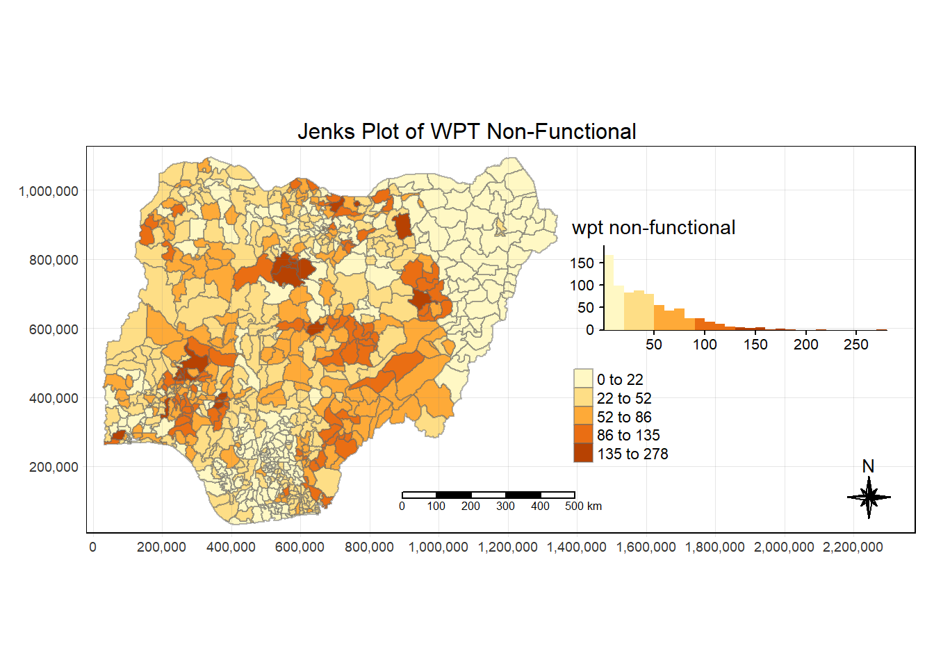
tmap_mode("plot")tmap mode set to plotting# make some bbox magic
bbox_new <- st_bbox(nga_wp_26391)
xrange <- bbox_new$xmax - bbox_new$xmin # range of x values
yrange <- bbox_new$ymax - bbox_new$ymin # range of y values
# bbox_new[1] <- bbox_new[1] - (0.25 * xrange) # xmin - left
bbox_new[3] <- bbox_new[3] + (0.75 * xrange) # xmax - right
# bbox_new[2] <- bbox_new[2] - (0.25 * yrange) # ymin - bottom
bbox_new[4] <- bbox_new[4] + (0.01 * yrange) # ymax - top
bbox_new <- bbox_new %>% # take the bounding box ...
st_as_sfc() # ... and make it a sf polygon
tm_shape(nga_wp_26391, bbox = bbox_new)+
tm_fill("wpt functional",
style = "jenks",
legend.hist = TRUE,
legend.is.portrait = TRUE,
legend.hist.z = 0.5) +
tm_borders(alpha = 0.5) +
tm_layout(main.title = "Jenks Plot of WPT Non-Functional",
main.title.position = "center",
main.title.size = 1,
legend.position = c("right", "center"),
frame = TRUE) +
tm_compass(type="8star", size = 2) +
tm_scale_bar(width = 0.2, position= c("center", "bottom")) +
tm_grid(lwd = 0.1, alpha = 0.2) 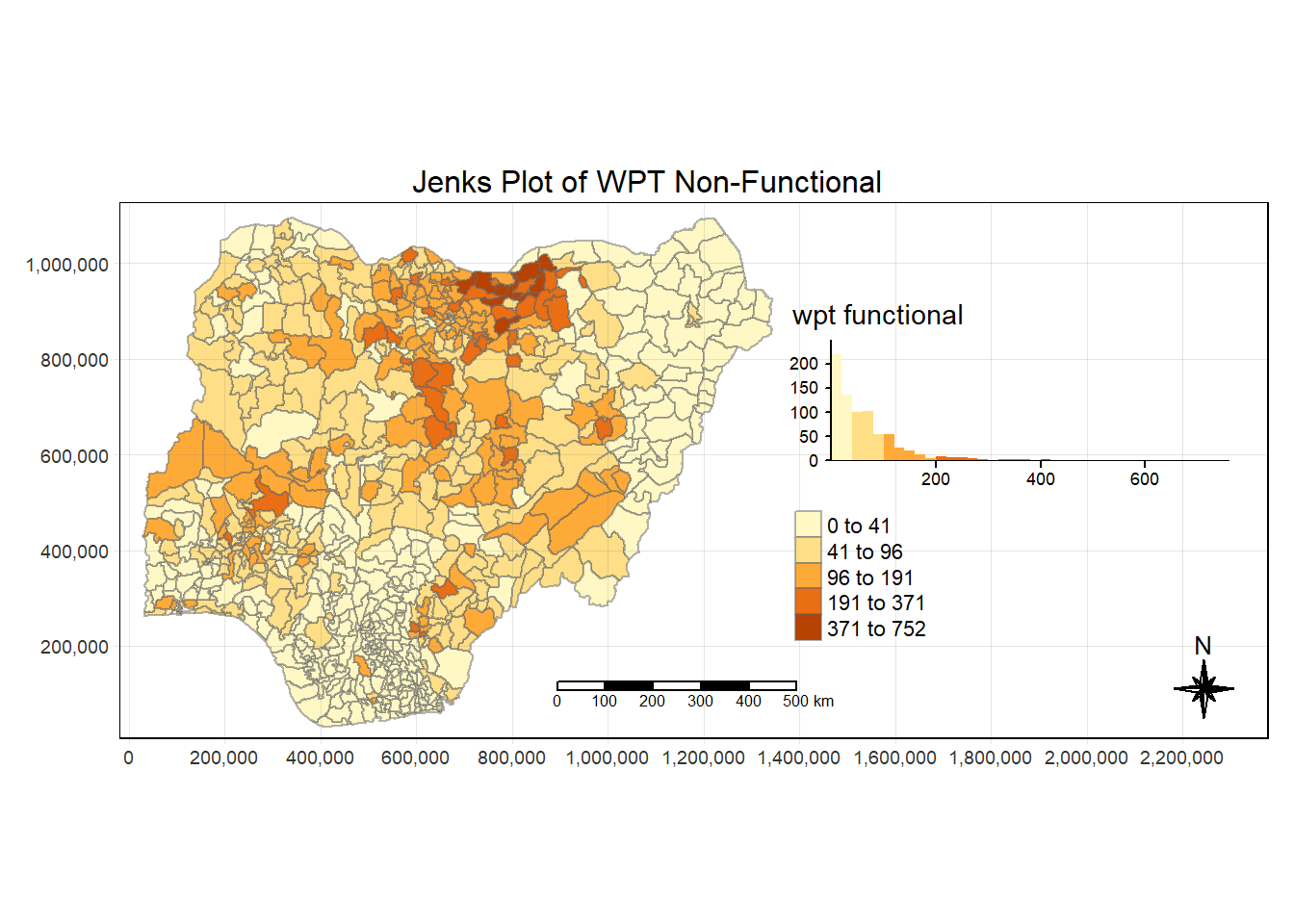
Step 7: Prepare the Spatial Weights
Usually for geospatial weights preparation, there are 2 options:
Contiguity based weights
- Useful when the polygons are of similar size
Distance based weights
Fixed distance
K-nearest neighbors (Adaptive distance)
Inversed-Distance
For our analysis, we will consider using the fixed distance based weights because the polygons size is not spread evenly across the map of Nigeria.
Prepare the coordinates
In order to work with fixed distance weight matrix, we need to prepare the coordinates of the center of gravity (COG) for all the polygons.
To achieve this, we will need to pass the column “geometry” into the function st_centroid() from the sf package. This function will calculate the COG and return us the coordinates accordingly. We will also make use of the map_dbl() function from the purrr package to apply the st_centroid() function to row.
Longitude:
longitude <- map_dbl(nga_wp_26391$geometry, ~st_centroid(.x)[[1]])Latitude:
latitude <- map_dbl(nga_wp_26391$geometry, ~st_centroid(.x)[[2]])Next, we will use the function of cbind() from the base package to bind our coordinates together.
Bind long & lat:
coords <- cbind(longitude, latitude)Check if output is correct:
head(coords) longitude latitude
[1,] 549364.0 123694.9
[2,] 547123.4 120376.5
[3,] 1189496.9 1059770.9
[4,] 489057.4 534262.6
[5,] 593718.2 113824.1
[6,] 642618.7 251222.3Determine cut off distance:
In order to ensure that each polygon has at least 1 neighbor, we need to determine the cut off distance. To do this, we will first run the k-nearest neighbor with k=1. This is achieved with the function of knearneigh() of the spdep package.
We run the code as follow:
k1 <- knn2nb(knearneigh(coords))After obtaining k1, a list of 774 polygons where each row shows the nearest neighbor polygon ID, we next need to calculate the distance between all of them using nbdists() of spdep.
Next, in order to calculate the summary, we need then to unlist() the output of nbdists(). This is then followed by using the summary() function which reports to us the max distance for us to use.
We run the code as follow:
k1dists <- unlist(nbdists(k1, coords, longlat = FALSE))
summary(k1dists) Min. 1st Qu. Median Mean 3rd Qu. Max.
2669 12834 20304 22084 27783 72139 From the above summary, it shows that the minimum distance for every polygon to have a neighbor is 71.661, thus we will use the value 72140.
Compute the fixed distance neighbor list:
With the above information, we will then compute the fixed distance weight matrix using dnearneigh() function from spdep. For this to work, we will need the coordinate of the polygons, min dist & max dist.
We will run the code as follow, this will give us a nb (neighbor) object data wm_d72:
nb_d72 <- dnearneigh(coords, 0, 72140, longlat = FALSE)
nb_d72Neighbour list object:
Number of regions: 774
Number of nonzero links: 18130
Percentage nonzero weights: 3.026327
Average number of links: 23.42377 Next, we will display our results for viewing:
str(nb_d72)List of 774
$ : int [1:63] 2 5 10 25 55 66 68 103 122 181 ...
$ : int [1:62] 1 5 10 25 55 66 68 103 122 181 ...
$ : int [1:2] 261 447
$ : int [1:10] 12 20 257 263 446 454 466 641 690 695
$ : int [1:56] 1 2 55 66 104 136 137 169 184 202 ...
$ : int [1:21] 9 14 18 19 56 170 217 218 330 337 ...
$ : int [1:19] 8 15 22 176 177 214 281 282 283 295 ...
$ : int [1:32] 7 15 22 49 176 177 214 275 276 277 ...
$ : int [1:26] 6 18 19 56 66 77 103 104 217 218 ...
$ : int [1:64] 1 2 23 25 66 103 181 190 191 203 ...
$ : int [1:22] 26 27 43 68 126 157 190 191 204 336 ...
$ : int [1:11] 4 135 257 263 401 417 429 446 454 690 ...
$ : int [1:13] 31 37 38 40 94 211 320 393 436 471 ...
$ : int [1:24] 6 170 193 194 195 217 309 310 311 362 ...
$ : int [1:27] 7 8 22 32 49 51 62 82 176 177 ...
$ : int [1:37] 30 38 39 41 44 45 70 71 120 124 ...
$ : int [1:34] 28 29 35 72 172 173 178 179 182 275 ...
$ : int [1:29] 6 9 19 56 66 77 103 104 217 218 ...
$ : int [1:41] 6 9 18 25 56 66 77 103 104 181 ...
$ : int [1:7] 4 106 239 263 419 454 466
$ : int [1:9] 60 61 162 269 484 520 578 596 626
$ : int [1:31] 7 8 15 32 49 51 62 82 176 177 ...
$ : int [1:64] 10 25 52 53 54 56 58 77 78 79 ...
$ : int [1:5] 123 476 527 673 761
$ : int [1:68] 1 2 10 19 23 54 56 66 77 103 ...
$ : int [1:30] 11 27 43 68 157 190 191 204 336 370 ...
$ : int [1:24] 11 26 43 68 157 191 204 336 370 371 ...
$ : int [1:43] 17 29 35 70 71 124 172 173 178 179 ...
$ : int [1:45] 17 28 35 70 71 124 172 173 178 179 ...
$ : int [1:30] 16 38 39 40 41 44 45 175 185 186 ...
$ : int [1:13] 13 37 94 158 210 211 212 289 308 561 ...
$ : int [1:28] 15 22 49 51 62 82 177 196 207 214 ...
$ : int [1:29] 47 111 130 142 145 155 166 219 227 233 ...
$ : int [1:11] 42 86 104 136 137 213 375 553 559 733 ...
$ : int [1:33] 17 28 29 72 172 173 178 179 182 275 ...
$ : int [1:8] 50 107 247 408 432 455 681 759
$ : int [1:21] 13 31 38 39 40 41 186 192 197 198 ...
$ : int [1:25] 13 16 30 37 39 40 41 44 186 192 ...
$ : int [1:27] 16 30 37 38 40 41 44 185 186 192 ...
$ : int [1:21] 13 30 37 38 39 41 44 186 192 211 ...
$ : int [1:22] 16 30 37 38 39 40 44 45 186 192 ...
$ : int [1:20] 34 86 136 137 184 202 285 286 375 499 ...
$ : int [1:19] 11 26 27 68 122 126 157 190 191 246 ...
$ : int [1:27] 16 30 38 39 40 41 45 70 175 186 ...
$ : int [1:27] 16 30 41 44 70 175 187 188 192 290 ...
$ : int [1:12] 119 380 387 417 423 429 438 459 521 656 ...
$ : int [1:24] 33 111 127 130 155 166 227 234 238 242 ...
$ : int [1:12] 64 65 74 113 131 265 386 407 428 482 ...
$ : int [1:30] 8 15 22 32 51 62 82 176 177 207 ...
$ : int [1:4] 36 107 409 432
$ : int [1:27] 15 22 32 49 62 82 177 207 214 284 ...
$ : int [1:47] 23 53 54 57 58 77 78 79 80 165 ...
$ : int [1:37] 23 52 54 57 58 78 79 80 165 189 ...
$ : int [1:58] 23 25 52 53 56 57 58 77 78 79 ...
$ : int [1:33] 1 2 5 68 122 157 169 184 190 208 ...
$ : int [1:51] 6 9 18 19 23 25 54 66 77 78 ...
$ : int [1:35] 52 53 54 58 78 79 80 165 189 197 ...
$ : int [1:37] 23 52 53 54 57 78 79 165 189 197 ...
$ : int [1:5] 128 129 493 700 748
$ : int [1:14] 21 61 158 269 310 311 561 563 578 589 ...
$ : int [1:11] 21 60 162 268 269 484 578 589 592 596 ...
$ : int [1:28] 15 22 32 49 51 82 177 196 207 214 ...
$ : int [1:5] 384 416 467 765 772
$ : int [1:7] 48 65 74 113 131 265 407
$ : int [1:11] 48 64 74 109 113 265 386 407 683 701 ...
$ : int [1:47] 1 2 5 9 10 18 19 25 56 103 ...
$ : int [1:26] 72 120 124 179 182 304 305 339 346 347 ...
$ : int [1:30] 1 2 11 26 27 43 55 122 157 190 ...
$ : int [1:8] 140 146 248 274 473 500 512 513
$ : int [1:44] 16 28 29 44 45 71 120 124 172 173 ...
$ : int [1:50] 16 28 29 70 120 124 172 173 175 178 ...
$ : int [1:19] 17 35 67 182 361 374 378 404 566 567 ...
$ : int [1:6] 361 374 377 404 665 666
$ : int [1:14] 48 64 65 109 113 116 251 265 672 683 ...
$ : int [1:15] 110 229 255 258 272 373 382 398 422 433 ...
$ : int [1:9] 254 287 427 459 470 547 647 677 751
$ : int [1:55] 9 18 19 23 25 52 54 56 78 79 ...
$ : int [1:51] 23 52 53 54 56 57 58 77 79 80 ...
$ : int [1:57] 23 52 53 54 56 57 58 77 78 80 ...
$ : int [1:39] 23 52 53 54 57 77 78 79 165 189 ...
$ : int [1:19] 99 145 227 233 242 255 270 426 449 483 ...
$ : int [1:21] 15 22 32 49 51 62 177 207 214 297 ...
$ : int [1:6] 132 258 383 414 529 767
$ : int [1:3] 148 437 692
$ : int [1:38] 101 105 130 142 145 155 156 219 235 242 ...
$ : int [1:17] 34 42 136 137 184 202 285 286 499 538 ...
$ : int [1:19] 147 149 151 221 226 245 267 399 410 415 ...
$ : int [1:5] 150 489 648 700 714
$ : int [1:11] 100 107 159 260 408 463 542 674 676 681 ...
$ : int 237
$ : int [1:3] 160 271 406
$ : int [1:11] 95 119 390 391 392 423 487 642 656 668 ...
$ : int [1:3] 354 607 665
$ : int [1:7] 13 31 158 436 561 596 709
$ : int [1:10] 92 390 391 392 405 423 469 656 708 770
$ : int [1:17] 97 108 139 167 168 350 389 403 412 420 ...
$ : int [1:13] 96 108 114 139 147 168 389 403 420 451 ...
$ : int [1:4] 153 231 432 696
$ : int [1:18] 81 145 154 167 227 233 255 270 426 449 ...
[list output truncated]
- attr(*, "class")= chr "nb"
- attr(*, "region.id")= chr [1:774] "1" "2" "3" "4" ...
- attr(*, "call")= language dnearneigh(x = coords, d1 = 0, d2 = 72140, longlat = FALSE)
- attr(*, "dnn")= num [1:2] 0 72140
- attr(*, "bounds")= chr [1:2] "GE" "LE"
- attr(*, "nbtype")= chr "distance"
- attr(*, "sym")= logi TRUEPlot the fixed distance neighbor list:
Using the plot() function, we will then visualize the neighbors that we have identified.
plot(nga_wp_26391$geometry, border="black", axes = TRUE)
plot(nb_d72, coords, add=TRUE, col="red")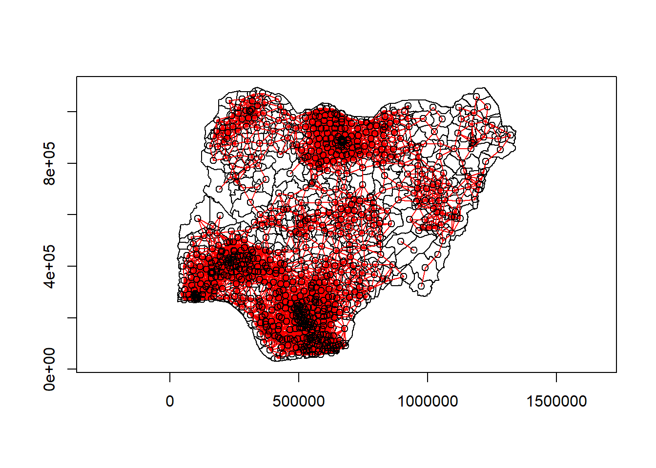
Step 8: Plotting Spatial Lag
Create row standardized weight matrix
We will use the nb2listw() function of spdep package to convert the nb list to weights. We set the style to “W” in order to perform the row-standardized steps.
We run the code as follow:
swm_d72<- nb2listw(nb_d72, style="W", zero.policy = TRUE)Compute spatial lag with row-standardized weights
Now we will use the lag.listw() function from spdep to return us the lag list. As an input, we will provide the row-standardized weight matrix and the variables “wpt non-functional” & wpt functional.
Lag for non-functional
We run the code as follow:
lag.list <- list(nga_wp_26391$shapeName, lag.listw(swm_d72, nga_wp_26391$`wpt non-functional`))
lag.res_NF <- as.data.frame(lag.list)
colnames(lag.res_NF) <- c("shapeName", "lag_NF")
nga_wp_26391$lag_NF <- lag.res_NF$lag_NFWe will then plot the lagged variable:
non_func <- qtm(nga_wp_26391, "wpt non-functional") +
tm_layout(main.title = "WPT Non-Functional",
main.title.position = "center",
main.title.size = 1,
legend.position = c("right", "bottom"),
legend.width = 0.3,
legend.height = 0.25,
frame = TRUE)
lag_non_func <- qtm(nga_wp_26391, "lag_NF")+
tm_layout(main.title = "Lagged WPT Non-Functional",
main.title.position = "center",
main.title.size = 1,
legend.position = c("right", "bottom"),
legend.width = 0.3,
legend.height = 0.25,
frame = TRUE)
tmap_arrange(non_func, lag_non_func, asp=1, ncol=2)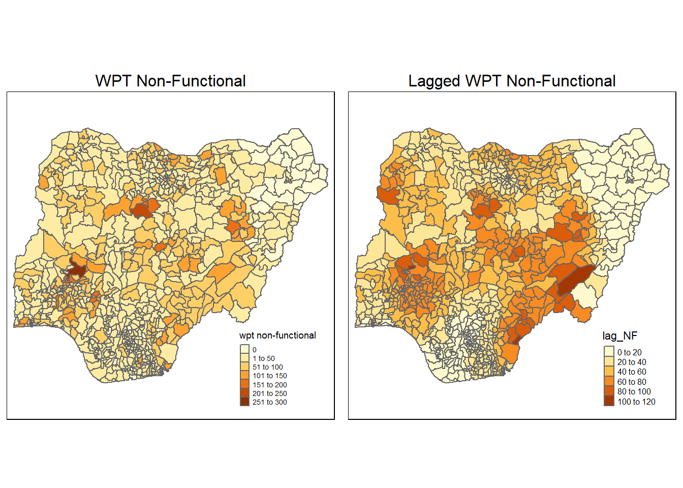
Lag for functional
We run the code as follow:
lag.list <- list(nga_wp_26391$shapeName, lag.listw(swm_d72, nga_wp_26391$`wpt functional`))
lag.res_F <- as.data.frame(lag.list)
colnames(lag.res_F) <- c("shapeName", "lag_F")
nga_wp_26391$lag_F <- lag.res_F$lag_Fnon_func <- qtm(nga_wp_26391, "wpt functional") +
tm_layout(main.title = "WPT Functional",
main.title.position = "center",
main.title.size = 1,
legend.position = c("right", "bottom"),
legend.width = 0.3,
legend.height = 0.25,
frame = TRUE)
lag_non_func <- qtm(nga_wp_26391, "lag_F")+
tm_layout(main.title = "Lagged WPT Functional",
main.title.position = "center",
main.title.size = 1,
legend.position = c("right", "bottom"),
legend.width = 0.3,
legend.height = 0.25,
frame = TRUE)
tmap_arrange(non_func, lag_non_func, asp=1, ncol=2)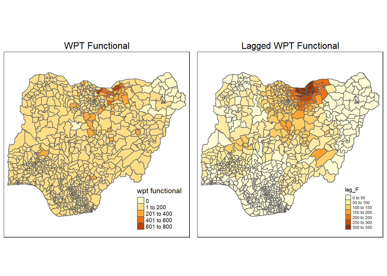
Step 9: Global Measure of Spatial Auto Correlation
Global Moran’s I
To get an indication of the global spatial clustering auto-correlation, we will perform the Moran’s I test. This is an analytic approach.
WPT Non-Functional Moran’s I test:
moran.test(nga_wp_26391$`wpt non-functional`,
listw=swm_d72,
zero.policy = TRUE,
na.action=na.omit)
Moran I test under randomisation
data: nga_wp_26391$`wpt non-functional`
weights: swm_d72
Moran I statistic standard deviate = 22.437, p-value < 2.2e-16
alternative hypothesis: greater
sample estimates:
Moran I statistic Expectation Variance
0.3264059335 -0.0012936611 0.0002133094 The global Moran’s I statistic is >> 0 and the p-value is statistically significant. This shows that there is indication of clustering of the non-functional water point.
WPT Functional Moran’s I test:
moran.test(nga_wp_26391$`wpt functional`,
listw=swm_d72,
zero.policy = TRUE,
na.action=na.omit)
Moran I test under randomisation
data: nga_wp_26391$`wpt functional`
weights: swm_d72
Moran I statistic standard deviate = 34.908, p-value < 2.2e-16
alternative hypothesis: greater
sample estimates:
Moran I statistic Expectation Variance
0.5041687788 -0.0012936611 0.0002096643 The global Moran’s I statistic is >> 0 and the p-value is statistically significant. This shows that there is indication of clustering of the functional water point.
Monte Carlo Moran’s I
While the Moran’s I test is fast since it works analytically, we will need to perform Monte Carlo Moran’s I. This method allows us to perform simulation by generating many random datasets across multiple simulations.
Our Moran’s I should fall to either extremes of the Moran’s I histogram from the simulation. This shows that our Moran’s I value did not occur because of randomization.
For the Monte Carlo Moran’s I test, we will use the moran.mc() function from the spdep package.
WPT Non-Functional Moran’s I test:
set.seed(1234)
bperm_NF= moran.mc(nga_wp_26391$`wpt non-functional`,
listw=swm_d72,
nsim=999,
zero.policy = TRUE,
na.action=na.omit)
bperm_NF
Monte-Carlo simulation of Moran I
data: nga_wp_26391$`wpt non-functional`
weights: swm_d72
number of simulations + 1: 1000
statistic = 0.32641, observed rank = 1000, p-value = 0.001
alternative hypothesis: greaterHere we can see that our results are statistically significant with p value of 0.001. Also the Moran’s I calculated is similar to the analytic test.
We will visualize the simulation results from Monte Carlo as follow:
hist(bperm_NF$res,
freq=TRUE,
breaks=20,
xlab="Simulated Moran's I for Non-Functional")
abline(v=0,
col="red") 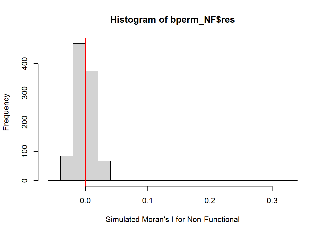
WPT Functional Moran’s I test:
set.seed(1234)
bperm_F= moran.mc(nga_wp_26391$`wpt functional`,
listw=swm_d72,
nsim=999,
zero.policy = TRUE,
na.action=na.omit)
bperm_F
Monte-Carlo simulation of Moran I
data: nga_wp_26391$`wpt functional`
weights: swm_d72
number of simulations + 1: 1000
statistic = 0.50417, observed rank = 1000, p-value = 0.001
alternative hypothesis: greaterHere we can see that our results are statistically significant with p value of 0.001. Also the Moran’s I calculated is similar to the analytic test.
We will visualize the simulation results from Monte Carlo as follow:
hist(bperm_F$res,
freq=TRUE,
breaks=20,
xlab="Simulated Moran's I for Non-Functional")
abline(v=0,
col="red") 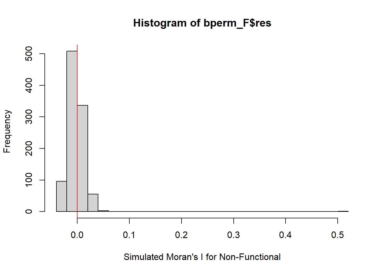
Step 10: Correlogram for Global Moran’s I
In the earlier section, we did the computation for Moran’s I and Monte Carlo Moran’s I. Both of them are a global measure of spatial autocorrelation. For both the non-functional and functional water point, we observe the presence of spatial correlation.
Another way for us to examine the spatial autocorrelation is by using correlogram. These diagram provide useful insights to how the Moran’s I or Geary’s C changes as the spatial lag/distance increase.
With the increase of spatial lad / distance, more neighbors are now included within the weight matrix. This then have further impact on the measure of spatial correlation.
For this section, we will use sp.correlogram() of spdep package. This function will require the neighbor object that we have calculated precious in step 7. We also need to state the style input. We will choose “W” for row-standardization.
We run the correlogram for the non-functional water point as follow:
MI_corr_NF <- sp.correlogram(nb_d72,
nga_wp_26391$`wpt non-functional`,
order=6,
method="I",
style="W",
zero.policy=TRUE)
plot(MI_corr_NF)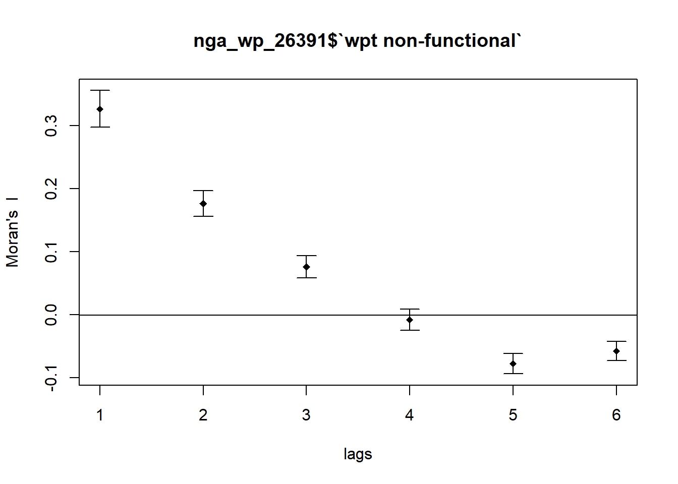
We check the output for statistical significance:
print(MI_corr_NF)Spatial correlogram for nga_wp_26391$`wpt non-functional`
method: Moran's I
estimate expectation variance standard deviate Pr(I) two sided
1 (774) 3.2641e-01 -1.2937e-03 2.1331e-04 22.4373 < 2.2e-16
2 (772) 1.7632e-01 -1.2970e-03 1.0426e-04 17.3957 < 2.2e-16
3 (772) 7.5578e-02 -1.2970e-03 7.8364e-05 8.6841 < 2.2e-16
4 (772) -8.3811e-03 -1.2970e-03 7.0841e-05 -0.8417 0.4
5 (772) -7.8042e-02 -1.2970e-03 6.4305e-05 -9.5703 < 2.2e-16
6 (772) -5.8045e-02 -1.2970e-03 5.6307e-05 -7.5626 3.952e-14
1 (774) ***
2 (772) ***
3 (772) ***
4 (772)
5 (772) ***
6 (772) ***
---
Signif. codes: 0 '***' 0.001 '**' 0.01 '*' 0.05 '.' 0.1 ' ' 1For the non-functional water points, our Moran’s I decrease with increase lag order. The p values for the first 3 rows are statistically significant.
We run the correlogram for the functional water point as follow:
MI_corr_F <- sp.correlogram(nb_d72,
nga_wp_26391$`wpt functional`,
order=10,
method="I",
style="W",
zero.policy=TRUE)
plot(MI_corr_F)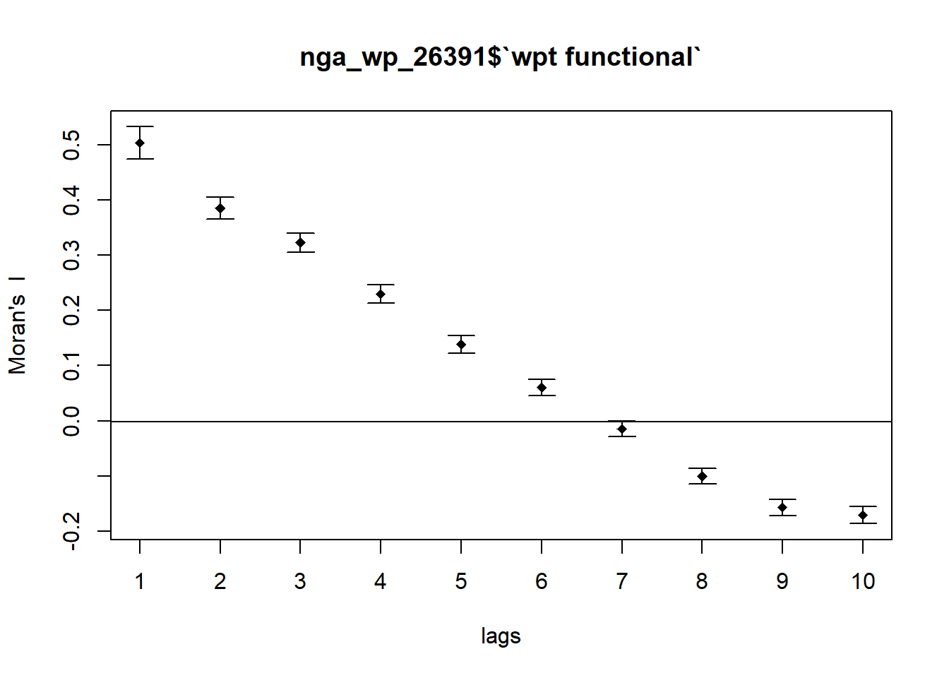
We check the output for statistical significance:
print(MI_corr_F)Spatial correlogram for nga_wp_26391$`wpt functional`
method: Moran's I
estimate expectation variance standard deviate Pr(I) two sided
1 (774) 5.0417e-01 -1.2937e-03 2.0966e-04 34.9081 < 2e-16
2 (772) 3.8586e-01 -1.2970e-03 1.0247e-04 38.2455 < 2e-16
3 (772) 3.2289e-01 -1.2970e-03 7.7024e-05 36.9384 < 2e-16
4 (772) 2.3024e-01 -1.2970e-03 6.9640e-05 27.7456 < 2e-16
5 (772) 1.3859e-01 -1.2970e-03 6.3217e-05 17.5942 < 2e-16
6 (772) 6.0259e-02 -1.2970e-03 5.5351e-05 8.2738 < 2e-16
7 (772) -1.4690e-02 -1.2970e-03 4.9489e-05 -1.9038 0.05694
8 (772) -1.0019e-01 -1.2970e-03 4.8999e-05 -14.1278 < 2e-16
9 (772) -1.5706e-01 -1.2970e-03 5.4069e-05 -21.1829 < 2e-16
10 (772) -1.7121e-01 -1.2970e-03 5.9742e-05 -21.9828 < 2e-16
1 (774) ***
2 (772) ***
3 (772) ***
4 (772) ***
5 (772) ***
6 (772) ***
7 (772) .
8 (772) ***
9 (772) ***
10 (772) ***
---
Signif. codes: 0 '***' 0.001 '**' 0.01 '*' 0.05 '.' 0.1 ' ' 1For the functional water points, our Moran’s I decrease more slowly lag order. The p values for the first 6 rows are statistically significant.
Step 11: Local Measure of Spatial Auto Correlation
While global Moran’s I is a useful statistic to tell us the presence of spatial auto-correlation across the map, it provides little info about the locality of the auto correlation.
The is where local Moran’s I come in to save the day. A high local Moran’s I statistic indicates similar values clustering around a polygon which is a good indication of spatial auto correlation.
Non-Functional Water Points (Local Moran’s I)
We will use the function order() to create an ordered name list of the areas. This is then followed by the function localmoran() from spdep. Our variable of interest and row-standardized weight matrix is required.
localMI_NF <- localmoran(nga_wp_26391$`wpt non-functional`, swm_d72)
head(localMI_NF) Ii E.Ii Var.Ii Z.Ii Pr(z != E(Ii))
1 0.361394136 -9.995243e-04 1.128237e-02 3.4117747 0.0006454144
2 0.074414950 -4.092463e-05 4.705097e-04 3.4325327 0.0005979717
3 1.258199847 -1.627684e-03 6.280738e-01 1.5896655 0.1119102304
4 -0.006652507 -5.427505e-05 4.151689e-03 -0.1024036 0.9184363392
5 0.082615173 -2.590965e-04 3.325093e-03 1.4372021 0.1506605779
6 0.006672593 -1.538445e-07 5.523369e-06 2.8392431 0.0045220690localMI_NF <- data.frame(localMI_NF)
colnames(localMI_NF)[5] ="Pr"
nga_wp_26391$lc_Ii_NF <- localMI_NF$'Ii'
nga_wp_26391$lc_Pr_NF <- localMI_NF$'Pr'localMI.map_NF <- tm_shape(nga_wp_26391) +
tm_fill(col = "lc_Ii_NF",
style = "jenks",
title = "local moran statistics") +
tm_borders(alpha = 0.5)+
tm_layout(main.title = "Plot of Local Moran's I",
main.title.position = "center",
main.title.size = 1,
legend.position = c("right", "bottom"),
frame = TRUE)
pvalue.map_NF <- tm_shape(nga_wp_26391) +
tm_fill(col = "lc_Pr_NF",
breaks=c(-Inf, 0.001, 0.01, 0.05, 0.1, Inf),
palette="-Blues",
title = "local Moran's I p-values") +
tm_borders(alpha = 0.5)+
tm_layout(main.title = "Plot of Local Moran's I P-Value",
main.title.position = "center",
main.title.size = 1,
legend.position = c("right", "bottom"),
frame = TRUE)
tmap_arrange(localMI.map_NF, pvalue.map_NF, asp=1, ncol=2)Variable(s) "lc_Ii_NF" contains positive and negative values, so midpoint is set to 0. Set midpoint = NA to show the full spectrum of the color palette.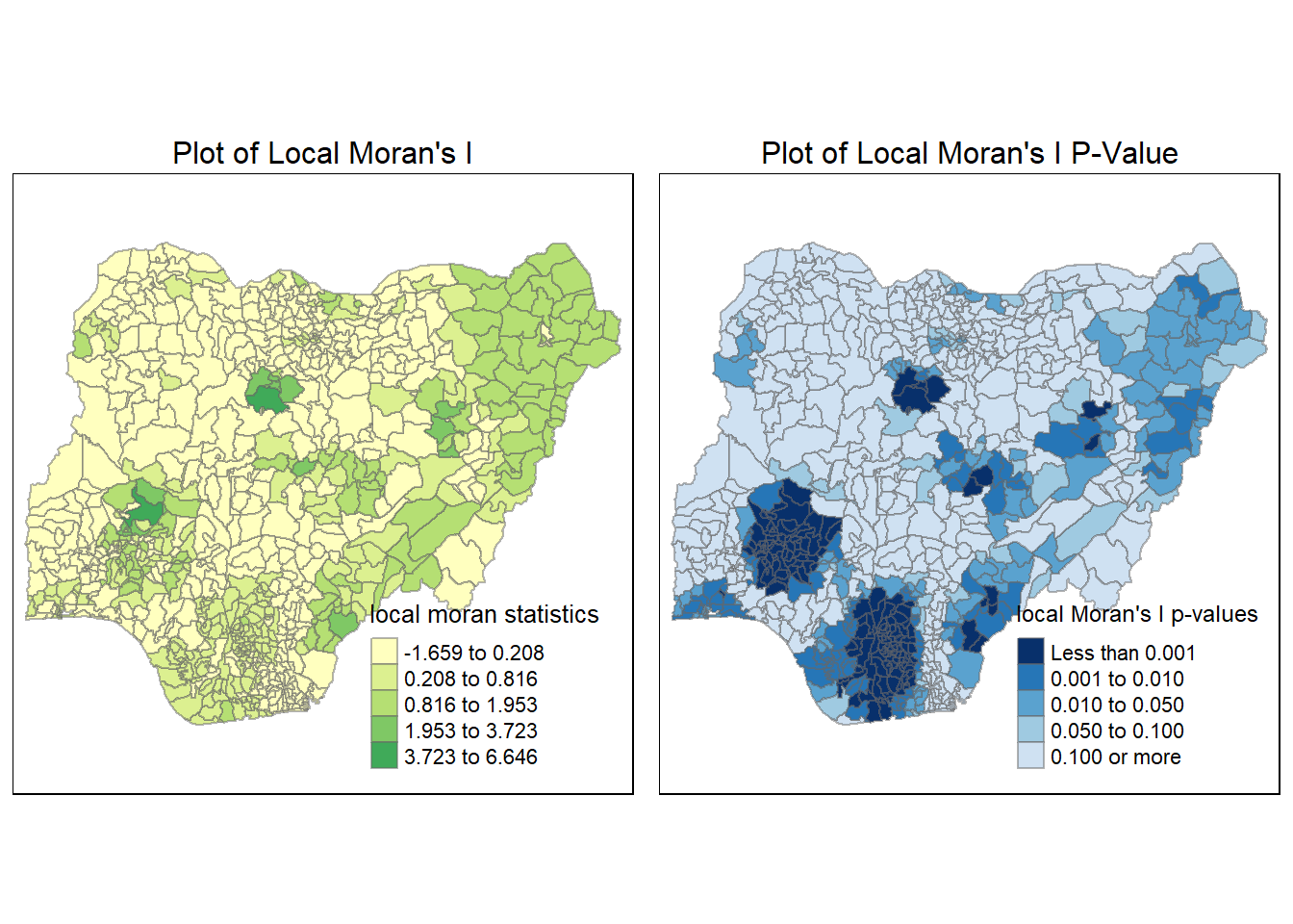
Functional Water Points (Local Moran’s I)
We perform the same steps for Functional water points:
localMI_F <- localmoran(nga_wp_26391$`wpt functional`, swm_d72)
head(localMI_F) Ii E.Ii Var.Ii Z.Ii Pr(z != E(Ii))
1 0.43151603 -7.191834e-04 0.008120236 4.7966255 1.613609e-06
2 0.27475350 -2.904635e-04 0.003338620 4.7601280 1.934703e-06
3 0.69235062 -8.956670e-04 0.345864093 1.1787856 2.384836e-01
4 0.05590525 -3.884365e-04 0.029702941 0.3266329 7.439455e-01
5 0.33277612 -3.884365e-04 0.004984321 4.7190630 2.369335e-06
6 0.05909213 -4.231402e-05 0.001519106 1.5172126 1.292130e-01localMI_F <- data.frame(localMI_F)
colnames(localMI_F)[5] ="Pr"
nga_wp_26391$lc_Ii_F <- localMI_F$'Ii'
nga_wp_26391$lc_Pr_F <- localMI_F$'Pr'localMI.map_F <- tm_shape(nga_wp_26391) +
tm_fill(col = "lc_Ii_F",
style = "jenks",
title = "local moran statistics") +
tm_borders(alpha = 0.5)+
tm_layout(main.title = "Plot of Local Moran's I",
main.title.position = "center",
main.title.size = 1,
legend.position = c("right", "bottom"),
frame = TRUE)
pvalue.map_F <- tm_shape(nga_wp_26391) +
tm_fill(col = "lc_Pr_F",
breaks=c(-Inf, 0.001, 0.01, 0.05, 0.1, Inf),
palette="-Blues",
title = "local Moran's I p-values") +
tm_borders(alpha = 0.5)+
tm_layout(main.title = "Plot of Local Moran's I P-Value",
main.title.position = "center",
main.title.size = 1,
legend.position = c("right", "bottom"),
frame = TRUE)
tmap_arrange(localMI.map_F, pvalue.map_F, asp=1, ncol=2)Variable(s) "lc_Ii_F" contains positive and negative values, so midpoint is set to 0. Set midpoint = NA to show the full spectrum of the color palette.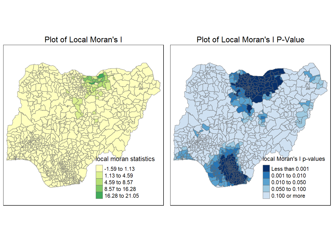
Step 12: Moran Scatterplot
Moran’s scatterplot is a useful tool for us to visualize the grouping of the polygons when we plot their variable of interest against the lagged variables. In the case there we observe spatial clustering of the variables across a cluster of polygons, we will expect the individual value of each polygon to be highly similar to the lagged variable. The lagged variable in this case refers to the average of the variable across the neighbors of the polygon.
Thus, points in the top-right and bottom-left of the Moran’s scatter plot represent polygons whose variable is highly similar with that of their neighbors. This is a good indication of spatial autocorrelation and clustering. On the other hand, points in the top-left and bottom-right of the scatter plot show polygon whose variable is significantly different from the average variable across the neighbors. This is an indication of negative autocorrelation or outlier.
The slope of the repression line in the Moran’s scatterplot represents the estimation of the global Moran’s I
Scatterplot for Non-Functional water points
To plot the Moran’s I scatterplot, we will use the moran.plot() function from spdep. We will need to provide the sf dataframe with the variable column along with the weight matrix. In this case, we will use our row-standardized weight matrix.
NF_scatter <- moran.plot(nga_wp_26391$`wpt non-functional`, swm_d72,
labels=as.character(nga_wp_26391$shapeName),
xlab="wpt non-functional",
ylab="Spatially lagged wpt non-functional")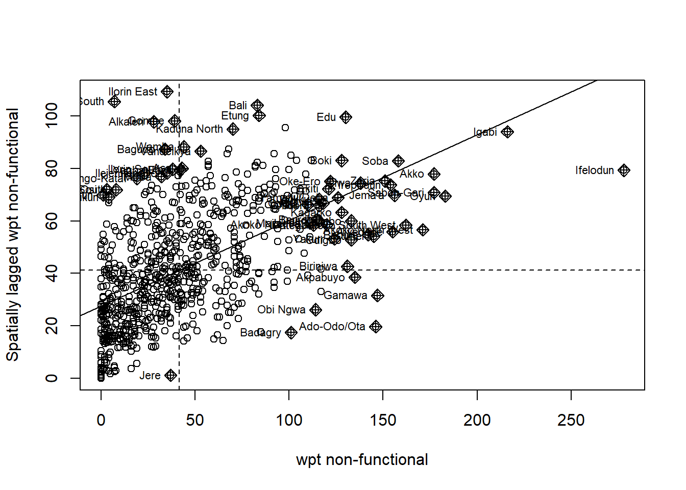
To help with comparison and ease of reading the scatterplot, it helps to perform some scaling. For this we will use the scale() function with divides the column by the largest value. We then use the piping function to save it as a vector before adding it to our dataframe.
We perform the following step:
scaled_NF <- scale(nga_wp_26391$`wpt non-functional`) %>% as.vector
nga_wp_26391$scaled_NF <- scaled_NFWe then plot the scatterplot once more:
NF_scatter_scaled <- moran.plot(nga_wp_26391$scaled_NF, swm_d72,
labels=as.character(nga_wp_26391$shapeName),
xlab="wpt non-functional",
ylab="Spatially lagged wpt non-functional")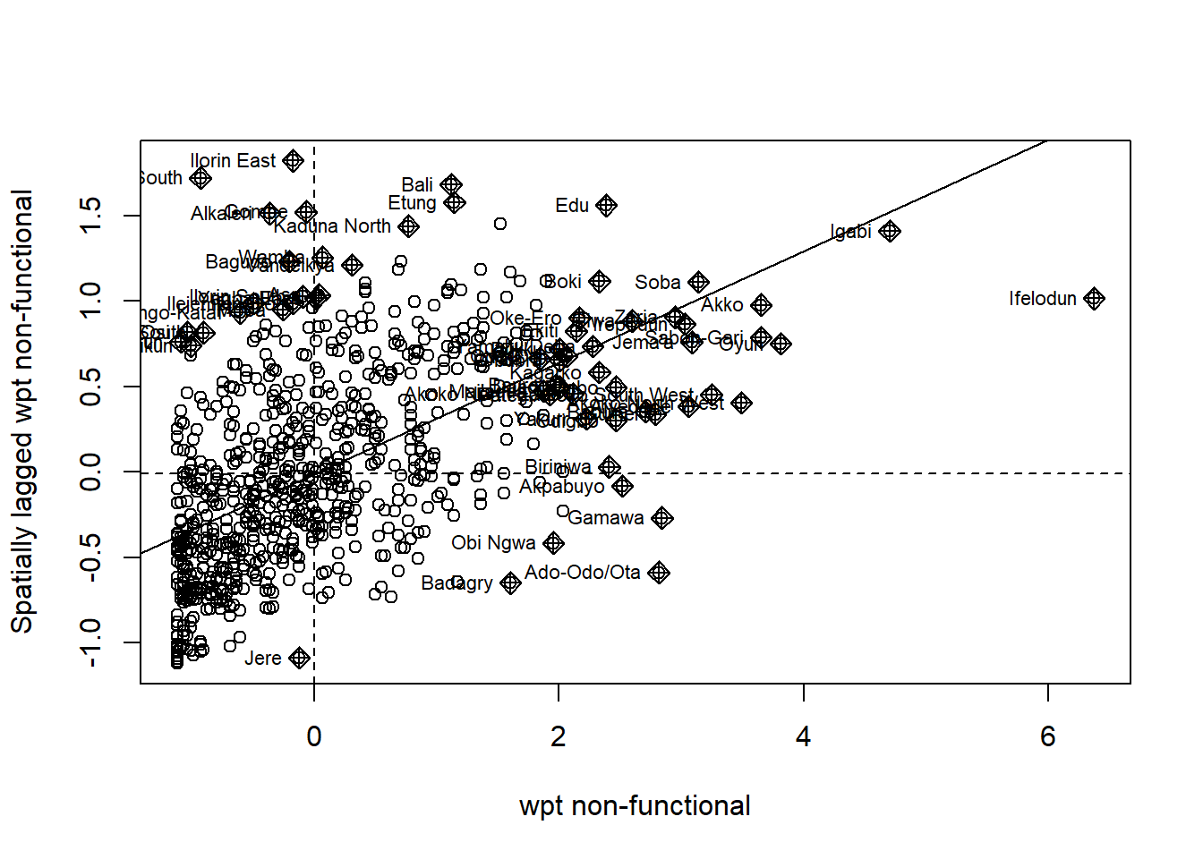
After scaling, we can see now that the axis is re-positioned to (0,0). From this scatterplot, we can see easily that there groups of polygons whose value exhibit clustering behavior. Interestingly, there are quite a number of outliers in the top-left and bottom right quadrant.
Scatterplot for Functional water points
We do the same for Functional water pints:
F_scatter <- moran.plot(nga_wp_26391$`wpt functional`, swm_d72,
labels=as.character(nga_wp_26391$shapeName),
xlab="wpt functional",
ylab="Spatially lagged wpt functional")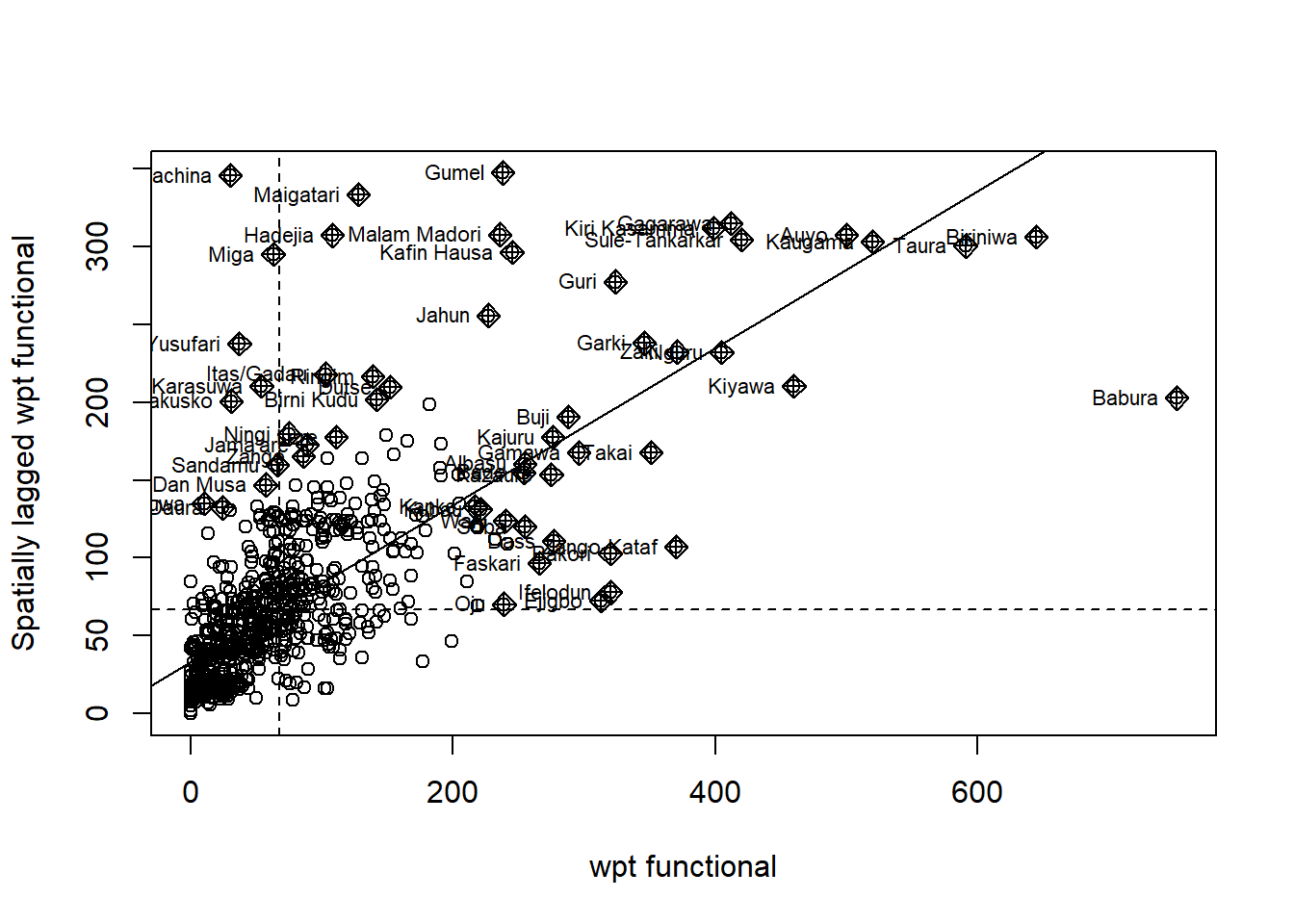
We perform scaling as follow:
scaled_F <- scale(nga_wp_26391$`wpt functional`) %>% as.vector
nga_wp_26391$scaled_F <- scaled_FWe plot the scaled Moran’s I scatterplot as follow:
F_scatter_scaled <- moran.plot(nga_wp_26391$scaled_F, swm_d72,
labels=as.character(nga_wp_26391$shapeName),
xlab="wpt non-functional",
ylab="Spatially lagged wpt non-functional")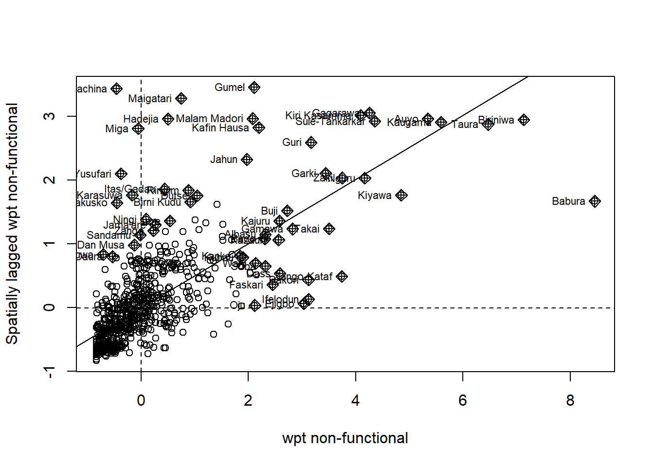
We see here significant number of points in the top-left and bottom right quadrant which is indicative of the spatial auto correlation and clustering. Similarly, we also see outliers in the plot.
Step 13: LISA map
While Moran’s I scatterplot provides a useful insight into the distribution of the points over 4 different types of quadrant, we have no idea about the location of each point relative to space. Thus it makes sense to indicate this on the map which then allows us to identify regions with significant spatial correlation and clustering.
LISA: Non-Functional water point
To achieve this, we will first create a vector to hold the different categories. We do this with a the function vector(), there should be 774 reflecting 774 polygons:
quadrant_NF <- vector(mode="numeric",length=nrow(localMI_NF))Previously in step 8, we have already computed the spatial lag based on row-standardized weight matrix. We view the value once more:
nga_wp_26391$lag_NF[1:20] [1] 26.34921 26.08065 0.00000 42.80000 34.75000 64.28571 31.15789 28.18750
[9] 46.53846 23.23438 13.90909 49.36364 52.38462 32.16667 19.74074 67.89189
[17] 46.11765 40.75862 36.82927 43.57143We then prepare a numeric vector to hold variable of interest that is mean adjusted:
DV_NF <- nga_wp_26391$`wpt non-functional` - mean(nga_wp_26391$`wpt non-functional`) We also prepare a numeric vector of the local Moran’s I value:
LM_I_NF <- localMI_NF[,1] - mean(localMI_NF[,1]) We will also set the significance level, that help us filter away rows with non-significant P values:
signif <- 0.05 Next we will work to fill up the value of the quadrant_NF:
quadrant_NF[DV_NF <0 & LM_I_NF>0] <- 1
quadrant_NF[DV_NF >0 & LM_I_NF<0] <- 2
quadrant_NF[DV_NF <0 & LM_I_NF<0] <- 3
quadrant_NF[DV_NF >0 & LM_I_NF>0] <- 4 For rows that are not statistically significant, we will set to 0:
quadrant_NF[localMI_NF[,5]>signif] <- 0Finally we will add our vector quadrant_NF to our main sf data object nga_wp_26391. We then follow this with a tmap plot taking note to use the style of category this time.
In addition, we will make use of the earlier plotted local Moran’s I map for comparison, we do this by calling the function tamp_arrange:
nga_wp_26391$quadrant_NF <- quadrant_NF
colors <- c("#ffffff", "#2c7bb6", "#abd9e9", "#fdae61", "#d7191c")
clusters <- c("insignificant", "low-low", "low-high", "high-low", "high-high")
LISA_NF <- tm_shape(nga_wp_26391) +
tm_fill(col = "quadrant_NF",
style = "cat",
palette = colors[c(sort(unique(quadrant_NF)))+1],
labels = clusters[c(sort(unique(quadrant_NF)))+1],
popup.vars = c("")) +
tm_borders(alpha=0.5) +
tm_layout(main.title = "Plot of LISA Non Functional WP",
main.title.position = "center",
main.title.size = 1,
legend.position = c("right", "bottom"),
frame = TRUE)
tm_view(set.zoom.limits = c(11,17)) #This line is not needed since not using interactive$tm_layout
$tm_layout$set.zoom.limits
[1] 11 17
$tm_layout$style
[1] NA
attr(,"class")
[1] "tm"tmap_arrange(LISA_NF, localMI.map_NF, asp=1, ncol=2)Variable(s) "lc_Ii_NF" contains positive and negative values, so midpoint is set to 0. Set midpoint = NA to show the full spectrum of the color palette.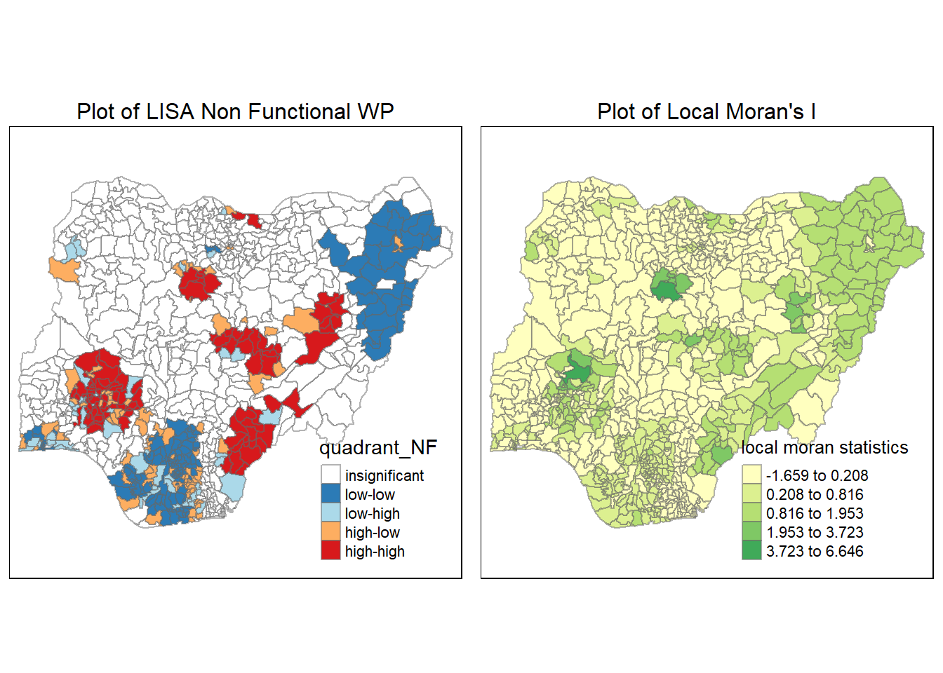
From this LISA plot above, we can see a clear relationship between the local Moran’s I plot earlier and the newly plotted LISA plot. We can see 5 hots spots in red, these 5 regions correspond to areas with high local Moran’s I value.
LISA: Functional Water Point
Same as above, we create a vector:
quadrant_F <- vector(mode="numeric",length=nrow(localMI_F))We check the earlier calculated lag values:
nga_wp_26391$lag_F[1:20] [1] 20.50794 20.41935 0.00000 59.10000 18.19643 93.80952 37.36842 43.56250
[9] 61.03846 17.04688 25.31818 58.63636 41.53846 50.29167 35.48148 63.18919
[17] 67.73529 48.44828 40.53659 87.85714We combine the earlier steps into a single chunk of code:
DV_F <- nga_wp_26391$`wpt functional` - mean(nga_wp_26391$`wpt functional`)
LM_I_F <- localMI_F[,1] - mean(localMI_F[,1])
quadrant_F[DV_F <0 & LM_I_F>0] <- 1
quadrant_F[DV_F >0 & LM_I_F<0] <- 2
quadrant_F[DV_F <0 & LM_I_F<0] <- 3
quadrant_F[DV_F >0 & LM_I_F>0] <- 4
quadrant_F[localMI_F[,5]>signif] <- 0Once again, we will plot the value:
nga_wp_26391$quadrant_F <- quadrant_F
colors <- c("#ffffff", "#2c7bb6", "#abd9e9", "#fdae61", "#d7191c")
clusters <- c("insignificant", "low-low", "low-high", "high-low", "high-high")
LISA_F <- tm_shape(nga_wp_26391) +
tm_fill(col = "quadrant_F",
style = "cat",
palette = colors[c(sort(unique(quadrant_F)))+1],
labels = clusters[c(sort(unique(quadrant_F)))+1],
popup.vars = c("")) +
tm_borders(alpha=0.5) +
tm_layout(main.title = "Plot of LISA Functional WP",
main.title.position = "center",
main.title.size = 1,
legend.position = c("right", "bottom"),
frame = TRUE)
tm_view(set.zoom.limits = c(11,17)) #This line is not needed since not using interactive$tm_layout
$tm_layout$set.zoom.limits
[1] 11 17
$tm_layout$style
[1] NA
attr(,"class")
[1] "tm"#
tmap_arrange(LISA_F, localMI.map_F, asp=1, ncol=2)Variable(s) "lc_Ii_F" contains positive and negative values, so midpoint is set to 0. Set midpoint = NA to show the full spectrum of the color palette.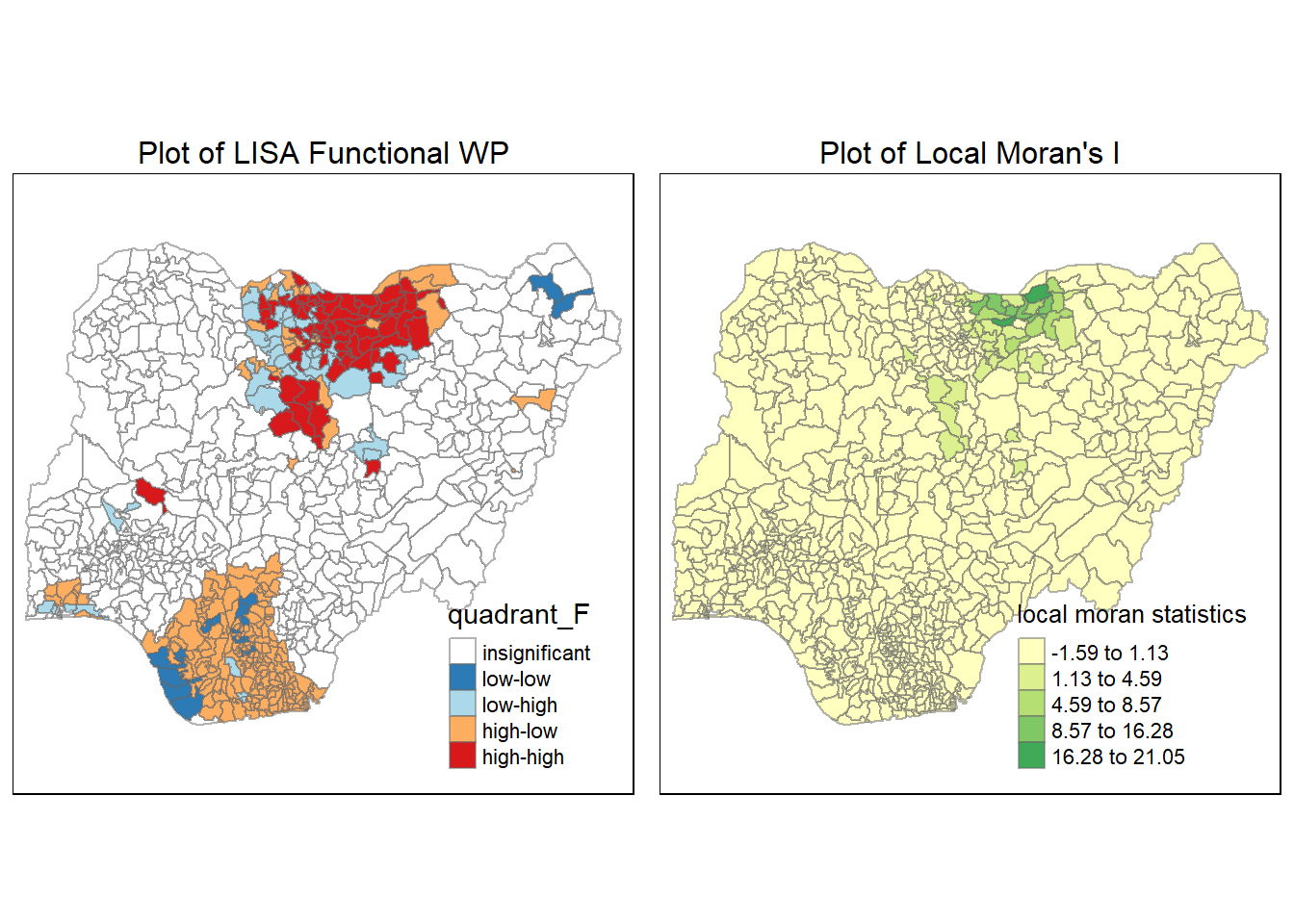
Again, we see that the hotpsots from the LISA map matches the regions of high local Moran’s I for the functional water points.
Step 14: Hot spot and Cold Spot with Getis & Ord’s G-Statistics G*
In the earlier steps, the Local Moran’s I help us to get a feel of the spatial correlation and clustering behavior. This is normally calculated with the value of the polygon itself excluded.
However sometimes besides clustering, it is also useful to know the hot spot and cold spot. This is because 2 groups of polygons can exhibit the same intensity of clustering, but the intensity of their value is different.
Getis & Ord thus swoops in to save the day. This is also another local measure of spatial correlation but this time it takes into account the value inside the polygon it self. Thus a polygon with a high intensity value will be now less affected by neighboring polygon’s with less intensive values.
One of the key requirements to calculate the G* will be to obtain the distance based weight matrix. We have prepared this matrix earlier in step 8.
Non-Functional water point G*
We compute the G* statistics using localG() function from spdep:
gi_NF <- localG(nga_wp_26391$`wpt non-functional`, swm_d72)
head(gi_NF)[1] -3.4117747 -3.4325327 -1.5896655 0.1024036 -1.4372021 2.8392431Next we will append the calculated values to the main sf dataframe:
nga_wp_26391$gi_NF <- gi_NFLastly, we will use the tmap package to plot the G* statistics along side the non-functioning water point. Here we will use the “jenks” style as it group values that are most similar together:
gdppc_NF <- tm_shape(nga_wp_26391) +
tm_fill(col = "wpt non-functional",
style = "jenks",
title = "No. of wpt non-functional") +
tm_borders(alpha = 0.5)+
tm_layout(main.title = "wpt non-functional",
main.title.position = "center",
main.title.size = 1,
legend.position = c("right", "bottom"),
frame = TRUE)
Gimap_NF <-tm_shape(nga_wp_26391) +
tm_fill(col = "gi_NF",
style = "jenks",
palette="-RdBu",
title = "local G*") +
tm_borders(alpha = 0.5)+
tm_layout(main.title = "wpt non-functional G*",
main.title.position = "center",
main.title.size = 1,
legend.position = c("right", "bottom"),
frame = TRUE)
tmap_arrange(gdppc_NF, Gimap_NF, asp=1, ncol=2)Variable(s) "gi_NF" contains positive and negative values, so midpoint is set to 0. Set midpoint = NA to show the full spectrum of the color palette.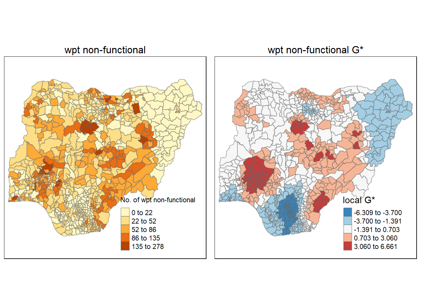
When compared to the plot on the number of non-functioning waterpoints, we see that the G* captures the hotspot patterns greatly. In addition, it also pinpointed the region of cold spots on the map.
Functional water point G*
Here we will perform the same steps as above into 1 code chunk:
gi_F <- localG(nga_wp_26391$`wpt functional`, swm_d72)
nga_wp_26391$gi_F <- gi_FWe till then plot the G* for Functional water point as follow:
gdppc_F <- tm_shape(nga_wp_26391) +
tm_fill(col = "wpt functional",
style = "jenks",
title = "No. of wpt functional") +
tm_borders(alpha = 0.5)+
tm_layout(main.title = "wpt functional",
main.title.position = "center",
main.title.size = 1,
legend.position = c("right", "bottom"),
frame = TRUE)
Gimap_F <-tm_shape(nga_wp_26391) +
tm_fill(col = "gi_F",
style = "jenks",
palette="-RdBu",
title = "local G*") +
tm_borders(alpha = 0.5)+
tm_layout(main.title = "wpt functional G*",
main.title.position = "center",
main.title.size = 1,
legend.position = c("right", "bottom"),
frame = TRUE)
tmap_arrange(gdppc_F, Gimap_F, asp=1, ncol=2)Variable(s) "gi_F" contains positive and negative values, so midpoint is set to 0. Set midpoint = NA to show the full spectrum of the color palette.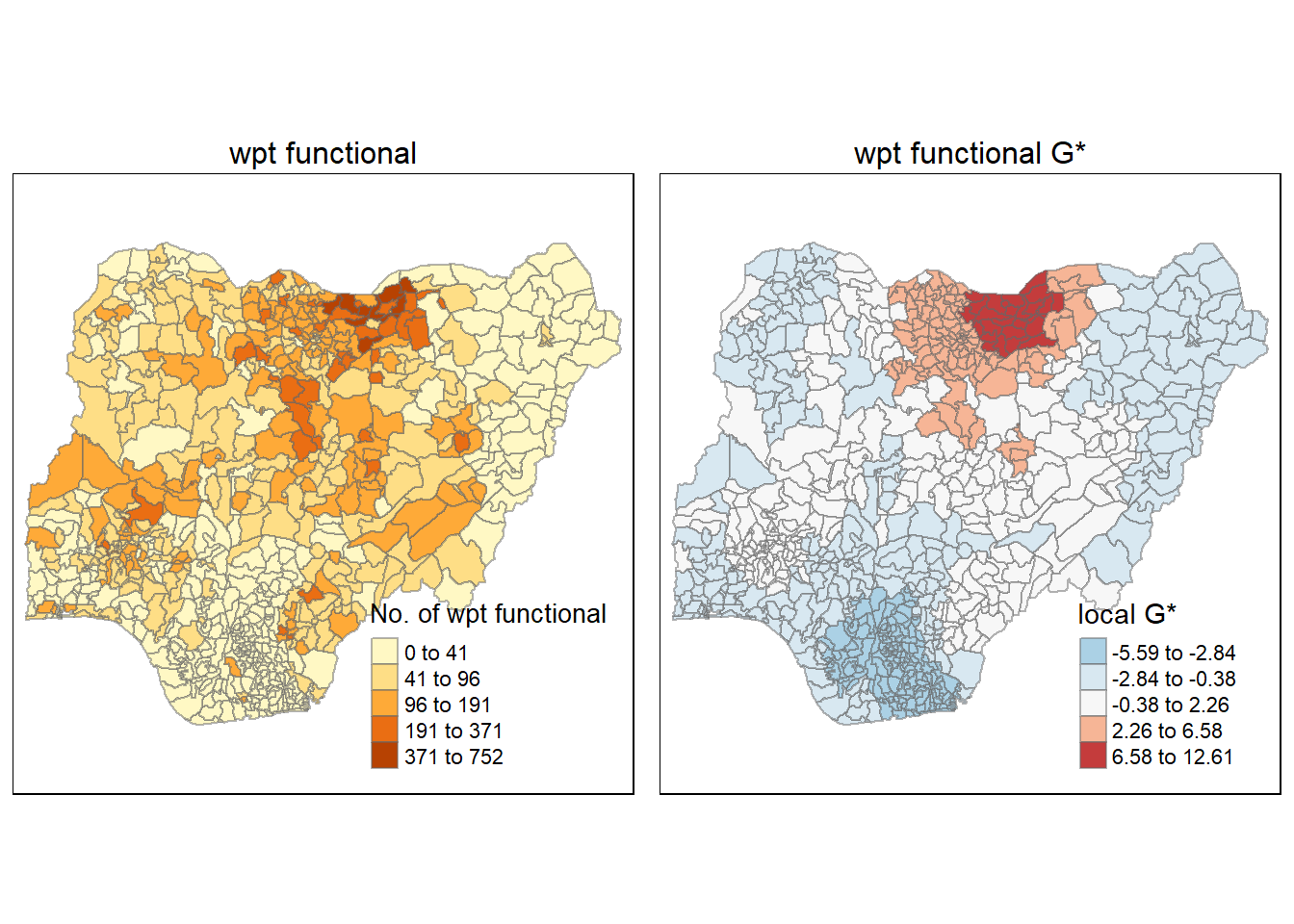
From this plot, we can see a clear hotspot at the top of the map. Interestingly we also observe a outer area with lower hotspot intensity.