pacman::p_load(here,
               sf, tidyverse, spdep,
               funModeling, tmap, ggpubr,
               corrplot, heatmaply, cluster, ClustGeo, factoextra, GGally
)Take Home Ex 2
Overview
Files required for Take Home Ex 2:
Water point attribute data (exported as CSV file):
https://www.waterpointdata.org/access-data/
Click on the button “Access WPdx+ Global Data Repository”
Then click export button & download as CSV file
Nigeria Administrative Level 2 Boundary File:
https://www.geoboundaries.org/
Enter “Nigeria” in the name filter column.
Download Nigeria-NGA-ADM2-2022 under the column “geoBoundaries”
Column Description can be found at:
https://www.waterpointdata.org/wp-content/uploads/2021/04/WPDx_Data_Standard.pdf
Step 1: Importing the required packages
The following packages are imported:
here: We use this to generate a path to the file stored at the root directory
sf: We use this for manipulation of simple features
funModeling: This is a useful package for us to do some EDA
tmap: We use for thematic plotting
tidyverse (https://www.tidyverse.org/)
ggplot2: Great for use during EDA
dplyr: Used for data manipulation (e.g. mutate() )
readr: We use this for reading rectangular data like csv
spdep: We use this for spatial related computations such as neighbors and weight matrix
corrplot: For plotting of the correlation object
heatmaply: For plotting of heatmaps and also for normalize() function
cluster: We use this package for performing clustering related computations
ClustGeo: We use this package for clustering with both variable and constraint space
factoextra: Extract and Visualize the Results of Multivariate Data Analyses
GGally: We use this package for multivariate analysis
Step 2: Shrinking the CSV file
Since the CSV file is really huge, we need to shrink it down first so we can store a copy of it on github. To do this, we will import the CSV file and then only select the rows that we are keen to keep using the select() function. The CSV will initially be imported as a tibble file format, thereafter once we select our referred columns, we also need to convert geometry coordinate before finally saving it as a rds file.
Using the here() function, we will generate a path to where the large csv file is stored:
csv_path <- here("data", "dataNigeria_2", "waterpoint", "wpdx.csv")
csv_path
[1] "D:/f4sared/ISSS624/data/dataNigeria_2/waterpoint/wpdx.csv"We will use the read_csv() of the readr package to ingest the CSV file while filtering for Nigeria:
wp_nga <- read_csv(csv_path) %>% filter(`#clean_country_name` == "Nigeria")We will use the select() to keep only columns of interest:
wp_nga_out <- wp_nga %>% select(7:10, 13:14, 22, 46:47, 62)Using st_as_sfc() of the sf package, we derive a new “Geometry” column based on `New Georeferenced Column`. This is because the column is as actually holding data in textual format.
We run the code as follow:
wp_nga_out$Geometry = st_as_sfc(wp_nga_out$`New Georeferenced Column`)Next using st_sf() of the sf package, we will convert the current object to sf dataframe:
wp_nga_out <- st_sf(wp_nga_out, crs=4326) Since the column `New Georeferenced Column` is no longer needed, we exclude it:
wp_nga_out <- wp_nga_out %>% select(1:9, 11)To save the file, we need to generate a save path:
savefile_path <- here("data", "dataNigeria_2", "waterpoint", "wp_nga_v2.rds")
savefile_path
[1] "D:/f4sared/ISSS624/data/dataNigeria_2/waterpoint/wp_nga_v2.rds"We then save the dataframe as a rds file:
write_rds(wp_nga_out, savefile_path)Step 3: Loading the data
Load the water point data:
Now, using the read_rds of the readr package, we load the data as follow:
-we rename all the columns for ease of work
-we also replace all N/A values of the status with “Unknown”
wp_nga <- read_rds(savefile_path) %>%
    rename(`status`=`#status_clean`) %>%
    rename(`adm1`=`#clean_adm1`) %>%
    rename(`adm2`=`#clean_adm2`) %>%
    rename(`tech_clean`=`#water_tech_clean`) %>%
    rename(`tech_category`=`#water_tech_category`) %>%
    mutate(status = replace_na(status, "Unknown")) %>%
    mutate(tech_category = replace_na(tech_category, "Unknown")) %>%
    mutate(tech_clean = replace_na(tech_clean, "Unknown"))
We will now use the st_geometry of the sf package to look at our data info:
st_geometry(wp_nga)Geometry set for 95008 features
Geometry type: POINT
Dimension: XY
Bounding box: xmin: 2.707441 ymin: 4.301812 xmax: 14.21828 ymax: 13.86568
Geodetic CRS: WGS 84
First 5 geometries:POINT (5.12 7.98)POINT (3.597668 6.964532)POINT (7.92972 6.48694)POINT (7.64867 6.72757)POINT (7.66485 6.7799)We will check the CRS of the loaded rds file using st_crs() from sf:
st_crs(wp_nga)Coordinate Reference System:
User input: EPSG:4326
wkt:
GEOGCRS["WGS 84",
ENSEMBLE["World Geodetic System 1984 ensemble",
MEMBER["World Geodetic System 1984 (Transit)"],
MEMBER["World Geodetic System 1984 (G730)"],
MEMBER["World Geodetic System 1984 (G873)"],
MEMBER["World Geodetic System 1984 (G1150)"],
MEMBER["World Geodetic System 1984 (G1674)"],
MEMBER["World Geodetic System 1984 (G1762)"],
MEMBER["World Geodetic System 1984 (G2139)"],
ELLIPSOID["WGS 84",6378137,298.257223563,
LENGTHUNIT["metre",1]],
ENSEMBLEACCURACY[2.0]],
PRIMEM["Greenwich",0,
ANGLEUNIT["degree",0.0174532925199433]],
CS[ellipsoidal,2],
AXIS["geodetic latitude (Lat)",north,
ORDER[1],
ANGLEUNIT["degree",0.0174532925199433]],
AXIS["geodetic longitude (Lon)",east,
ORDER[2],
ANGLEUNIT["degree",0.0174532925199433]],
USAGE[
SCOPE["Horizontal component of 3D system."],
AREA["World."],
BBOX[-90,-180,90,180]],
ID["EPSG",4326]]We will check the output:
st_crs(wp_nga)Coordinate Reference System:
User input: EPSG:4326
wkt:
GEOGCRS["WGS 84",
ENSEMBLE["World Geodetic System 1984 ensemble",
MEMBER["World Geodetic System 1984 (Transit)"],
MEMBER["World Geodetic System 1984 (G730)"],
MEMBER["World Geodetic System 1984 (G873)"],
MEMBER["World Geodetic System 1984 (G1150)"],
MEMBER["World Geodetic System 1984 (G1674)"],
MEMBER["World Geodetic System 1984 (G1762)"],
MEMBER["World Geodetic System 1984 (G2139)"],
ELLIPSOID["WGS 84",6378137,298.257223563,
LENGTHUNIT["metre",1]],
ENSEMBLEACCURACY[2.0]],
PRIMEM["Greenwich",0,
ANGLEUNIT["degree",0.0174532925199433]],
CS[ellipsoidal,2],
AXIS["geodetic latitude (Lat)",north,
ORDER[1],
ANGLEUNIT["degree",0.0174532925199433]],
AXIS["geodetic longitude (Lon)",east,
ORDER[2],
ANGLEUNIT["degree",0.0174532925199433]],
USAGE[
SCOPE["Horizontal component of 3D system."],
AREA["World."],
BBOX[-90,-180,90,180]],
ID["EPSG",4326]]Load the Geo Boundary data:
Once again, we need to generate the path as follow:
boundary_path <- here("data", "dataNigeria_2", "boundary")
boundary_path
[1] "D:/f4sared/ISSS624/data/dataNigeria_2/boundary"Using the st_read() function of the sf package, we will load the boundary file:
nga <- st_read(dsn = boundary_path,
               layer = "geoBoundaries-NGA-ADM2",
               crs = 4326) %>% select(shapeName)
Reading layer `geoBoundaries-NGA-ADM2' from data source
`D:\f4sared\ISSS624\data\dataNigeria_2\boundary' using driver `ESRI Shapefile'
Simple feature collection with 774 features and 5 fields
Geometry type: MULTIPOLYGON
Dimension: XY
Bounding box: xmin: 2.668534 ymin: 4.273007 xmax: 14.67882 ymax: 13.89442
Geodetic CRS: WGS 84We will check the CRS with st_crs() from sf package:
st_crs(nga)Coordinate Reference System:
User input: EPSG:4326
wkt:
GEOGCRS["WGS 84",
ENSEMBLE["World Geodetic System 1984 ensemble",
MEMBER["World Geodetic System 1984 (Transit)"],
MEMBER["World Geodetic System 1984 (G730)"],
MEMBER["World Geodetic System 1984 (G873)"],
MEMBER["World Geodetic System 1984 (G1150)"],
MEMBER["World Geodetic System 1984 (G1674)"],
MEMBER["World Geodetic System 1984 (G1762)"],
MEMBER["World Geodetic System 1984 (G2139)"],
ELLIPSOID["WGS 84",6378137,298.257223563,
LENGTHUNIT["metre",1]],
ENSEMBLEACCURACY[2.0]],
PRIMEM["Greenwich",0,
ANGLEUNIT["degree",0.0174532925199433]],
CS[ellipsoidal,2],
AXIS["geodetic latitude (Lat)",north,
ORDER[1],
ANGLEUNIT["degree",0.0174532925199433]],
AXIS["geodetic longitude (Lon)",east,
ORDER[2],
ANGLEUNIT["degree",0.0174532925199433]],
USAGE[
SCOPE["Horizontal component of 3D system."],
AREA["World."],
BBOX[-90,-180,90,180]],
ID["EPSG",4326]]Handling Repeated Names
We refer to our classmates’ method:
https://jordan-isss624-geospatial.netlify.app/posts/geo/geospatial_exercise/#data-wrangling
Get the index of the rows that are duplicated
bool_list <- duplicated(nga$shapeName)
duplicated_names <- nga$shapeName[bool_list]
index_rows <- which(nga$shapeName %in% duplicated_names)
index_rows
[1] 94 95 304 305 355 356 519 520 546 547 693 694duplicated_names[1] "Bassa" "Ifelodun" "Irepodun" "Nasarawa" "Obi" "Surulere"Save the duplicated region as a new sf dataframe:
dup_regions <- nga %>% filter(nga$shapeName %in% duplicated_names)Select the rows from the waterpoint data whose adm 2 is part of the duplicated list
dup_points <- wp_nga %>%
  filter(adm2 %in%
           c("Bassa",
             "Ifelodun",
             "Irepodun",
             "Nasarawa",
             "Obi",
             "Surulere"))
Perform a simple intersection between the duplicated regions and the earlier filtered waterpoints:
dup_intersect <- st_intersects(dup_regions, dup_points)Next, we will use the slice function to select rows that fall under each of the duplicated region, then we will display the column “adm1” which shows the sub name for that region.
Bassa 1:
(dup_points %>% slice(unlist(dup_intersect[1])))$adm1 %>% head()[1] "Kogi" "Kogi" "Kogi" "Kogi" "Kogi" "Kogi"Bassa 2:
(dup_points %>% slice(unlist(dup_intersect[2])))$adm1 %>% head()[1] "Plateau" "Plateau" "Plateau" "Plateau" "Plateau" "Plateau"Ifelodun 1:
(dup_points %>% slice(unlist(dup_intersect[3])))$adm1 %>% head()[1] "Kwara" "Kwara" "Kwara" "Kwara" "Kwara" "Kwara"Ifelodun 2:
(dup_points %>% slice(unlist(dup_intersect[4])))$adm1 %>% head()[1] "Osun" "Osun" "Osun" "Osun" "Osun" "Osun"Irepodun 1:
(dup_points %>% slice(unlist(dup_intersect[5])))$adm1 %>% head()[1] "Kwara" "Kwara" "Kwara" "Kwara" "Kwara" "Kwara"Irepodun 2:
(dup_points %>% slice(unlist(dup_intersect[6])))$adm1 %>% head()[1] "Osun" "Osun" "Osun" "Osun" "Osun" "Osun"Nasarawa 1:
(dup_points %>% slice(unlist(dup_intersect[7])))$adm1 %>% head()character(0)Nasarawa 2:
(dup_points %>% slice(unlist(dup_intersect[8])))$adm1 %>% head()[1] "Nasarawa" "Nasarawa" "Nasarawa" "Nasarawa" "Nasarawa" "Nasarawa"Obi 1:
(dup_points %>% slice(unlist(dup_intersect[9])))$adm1 %>% head()[1] "Benue" "Benue" "Benue" "Benue" "Benue" "Benue"Obi 2:
(dup_points %>% slice(unlist(dup_intersect[10])))$adm1 %>% head()[1] "Nasarawa" "Nasarawa" "Nasarawa" "Nasarawa" "Nasarawa" "Nasarawa"Surulere 1:
(dup_points %>% slice(unlist(dup_intersect[11])))$adm1 %>% head()[1] "Lagos" "Lagos" "Lagos" "Lagos" "Lagos" "Lagos"Surulere 2:
(dup_points %>% slice(unlist(dup_intersect[12])))$adm1 %>% head()[1] "Oyo" "Oyo" "Oyo" "Oyo" "Oyo" "Oyo"Plot the areas that are duplicated:
tmap_mode("view")
tm_shape(dup_rows) + tm_polygons()
Rename the duplicated areas
nga$shapeName[index_rows] <- c("Bassa_Kogi", "Bassa_Plateau",
                               "Ifelodun_Kwara", "Ifelodun_Osun",
                               "Irepodun_Kwara", "Irepodun_Osun",
                               "Nasarawa_0", "Nasarawa_Nasarawa",
                               "Obi_Benue", "Obi_Nasawara",
                               "Surulere_Lagos","Surulere_Oyo")
Check to see if there are any repeated rows again:
bool_list <- duplicated(nga$shapeName)
duplicated_names <- nga$shapeName[bool_list]
index_rows <- which(nga$shapeName %in% duplicated_names)
index_rowsinteger(0)We use the rm() function to remove the environment variables to reduce clutter:
rm(dup_intersect)
rm(dup_points)
rm(dup_regions)
rm(bool_list)
rm(duplicated_names)
rm(index_rows)
Step 4: Data Wrangling
Status of water point
Using the freq() from funModeling, we will check the distribution of status of the water points:
freq(data=wp_nga, input = 'status')Warning: The `<scale>` argument of `guides()` cannot be `FALSE`. Use "none" instead as
of ggplot2 3.3.4.
ℹ The deprecated feature was likely used in the funModeling package.
Please report the issue at <https://github.com/pablo14/funModeling/issues>.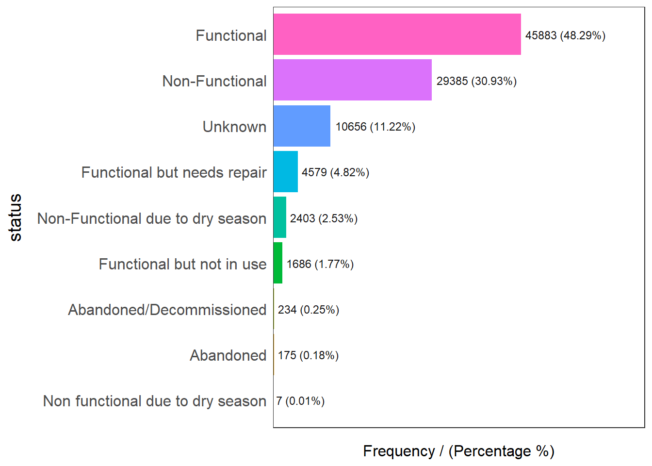
                            status frequency percentage cumulative_perc
1                       Functional     45883      48.29           48.29
2                   Non-Functional     29385      30.93           79.22
3                          Unknown     10656      11.22           90.44
4      Functional but needs repair      4579       4.82           95.26
5 Non-Functional due to dry season      2403       2.53           97.79
6        Functional but not in use      1686       1.77           99.56
7         Abandoned/Decommissioned       234       0.25           99.81
8                        Abandoned       175       0.18           99.99
9 Non functional due to dry season         7       0.01          100.00
Functional water point
wpt_functional <- wp_nga %>%
  filter(status %in%
           c("Functional",
             "Functional but not in use",
"Functional but needs repair"))freq(data=wpt_functional,
input = 'status')Non Functional water point
wpt_nonfunctional <- wp_nga %>%
  filter(status %in%
           c("Abandoned/Decommissioned",
             "Abandoned",
             "Non-Functional",
             "Non functional due to dry season",
"Non-Functional due to dry season"))freq(data=wpt_nonfunctional,
input = 'status')Unknown
wpt_unknown <- wp_nga %>% filter(status == "Unknown")Water point Technology
wpt_hand_pump <- wp_nga %>% filter(tech_category == "Hand Pump")freq(data=wp_nga, input = 'tech_category')Usage Capacity < 1000
We first use the freq() of the funModeling package to show the distribution of capacity:
freq(data=wp_nga, input = 'usage_capacity')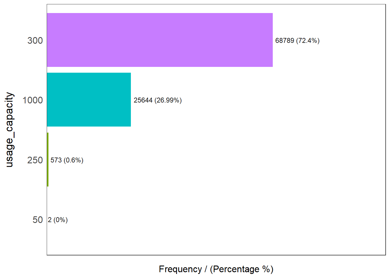
  usage_capacity frequency percentage cumulative_perc
1            300     68789      72.40           72.40
2           1000     25644      26.99           99.39
3            250       573       0.60           99.99
4             50         2       0.00          100.00
The above plots shows us that majority of the values are either 300 or 1000.
This for our analysis, we will focus on values that are less than 1000
wpt_1000 <- wp_nga %>% filter(usage_capacity < 1000)Rural waterpoints
wpt_rural <- wp_nga %>% filter(is_urban == FALSE)freq(data=wp_nga, input = 'is_urban')Point-in-Polygon
Since each of the waterpoint in wp_nga belongs to a specific region, we need to allocated them into their own respective region, we do this using the the st_intersect() function of the sf package along with the mutate() function of the dplyr package.
We perform Point in polygon as follow:
nga_wp <- nga %>%
  mutate(`total_wpt` = lengths(
    st_intersects(nga, wp_nga))) %>%
  mutate(`wpt_functional` = lengths(
    st_intersects(nga, wpt_functional))) %>%
  mutate(`wpt_non_functional` = lengths(
    st_intersects(nga, wpt_nonfunctional))) %>%
  mutate(`wpt_unknown` = lengths(
    st_intersects(nga, wpt_unknown))) %>%
  mutate(`wpt_hand_pump` = lengths(
    st_intersects(nga, wpt_hand_pump))) %>%
  mutate(`wpt_1000` = lengths(
    st_intersects(nga, wpt_1000))) %>%
  mutate(`wpt_rural` = lengths(
    st_intersects(nga, wpt_rural)))
Calculate Percentage:
nga_wp <- nga_wp %>%
  mutate(pct_functional = `wpt_functional`/`total_wpt`) %>%
  mutate(`pct_non_functional` = `wpt_non_functional`/`total_wpt`) %>%
  mutate(`pct_hand_pump` = `wpt_hand_pump`/`total_wpt`) %>%
  mutate(`pct_1000` = `wpt_1000`/`total_wpt`) %>%
  mutate(`pct_rural` = `wpt_rural`/`total_wpt`)
Replace NaN with 0
NaN_list <- is.nan(nga_wp$pct_functional)
nga_wp$pct_functional[NaN_list] <- 0

NaN_list <- is.nan(nga_wp$pct_non_functional)
nga_wp$pct_non_functional[NaN_list] <- 0

NaN_list <- is.nan(nga_wp$pct_hand_pump)
nga_wp$pct_hand_pump[NaN_list] <- 0

NaN_list <- is.nan(nga_wp$pct_hand_pump)
nga_wp$pct_hand_pump[NaN_list] <- 0

NaN_list <- is.nan(nga_wp$pct_1000)
nga_wp$pct_1000[NaN_list] <- 0

NaN_list <- is.nan(nga_wp$pct_rural)
nga_wp$pct_rural[NaN_list] <- 0qtm(nga_wp, fill = "wpt hand pump") +
tm_layout(legend.height = 0.4,legend.width = 0.4)Once again, we now clean the environment of variables:
rm(wpt_1000)
rm(wpt_functional)
rm(wpt_hand_pump)
rm(wpt_nonfunctional)
rm(wpt_rural)
rm(wpt_unknown)
rm(NaN_list)
rm(wp_nga)
Performing Projection to 26391
We will now use st_trasnform() function to project to the Nigeria CRS of 26391:
nga_wp <- st_transform(nga_wp, crs = 26391)We will also transform the boundary file:
nga <- st_transform(nga, crs = 26391)Step 5: EDA
Spatial Mapping
First we will do a spatial plot with the functional & non-functional vars to check for any spatial patterns.
We will make use of the tmap package and the tmap_arrange() function:
functional.map <- tm_shape(nga_wp) +
                  tm_fill(col = "wpt_functional",
                          n = 5,
                          style = "jenks",
                          title = "wpt_functional") +
                  tm_borders(alpha = 0.9) +
                  tm_layout(main.title = "Functional water points distribution",
                          main.title.position = "center",
                          main.title.size = 1.2,
                          legend.height = 0.6,
                          legend.width = 0.6,
                          frame = TRUE)

non_functional.map <- tm_shape(nga_wp) +
                    tm_fill(col = "wpt_non_functional",
                            n = 5,
                            style = "jenks",
                            title = "wpt_non_functional") +
                tm_borders(alpha = 0.9) +
                tm_layout(main.title = "Non-functional water points distribution",
                            main.title.position = "center",
                            main.title.size = 1.2,
                            legend.height = 0.6,
                            legend.width = 0.6,
                            frame = TRUE)


pct_functional.map <- tm_shape(nga_wp) +
                  tm_fill(col = "pct_functional",
                          n = 5,
                          style = "jenks",
                          title = "pct_functional") +
                  tm_borders(alpha = 0.9) +
                  tm_layout(main.title = "Functional water points %",
                          main.title.position = "center",
                          main.title.size = 1.2,
                          legend.height = 0.6,
                          legend.width = 0.6,
                          frame = TRUE)

pct_non_functional.map <- tm_shape(nga_wp) +
                  tm_fill(col = "pct_non_functional",
                          n = 5,
                          style = "jenks",
                          title = "pct_non_functional") +
                  tm_borders(alpha = 0.9) +
                  tm_layout(main.title = "Non-Functional water points %",
                          main.title.position = "center",
                          main.title.size = 1.2,
                          legend.height = 0.6,
                          legend.width = 0.6,
                          frame = TRUE)

tmap_arrange(functional.map, non_functional.map,
             pct_functional.map,pct_non_functional.map,
             asp=NA, ncol=2)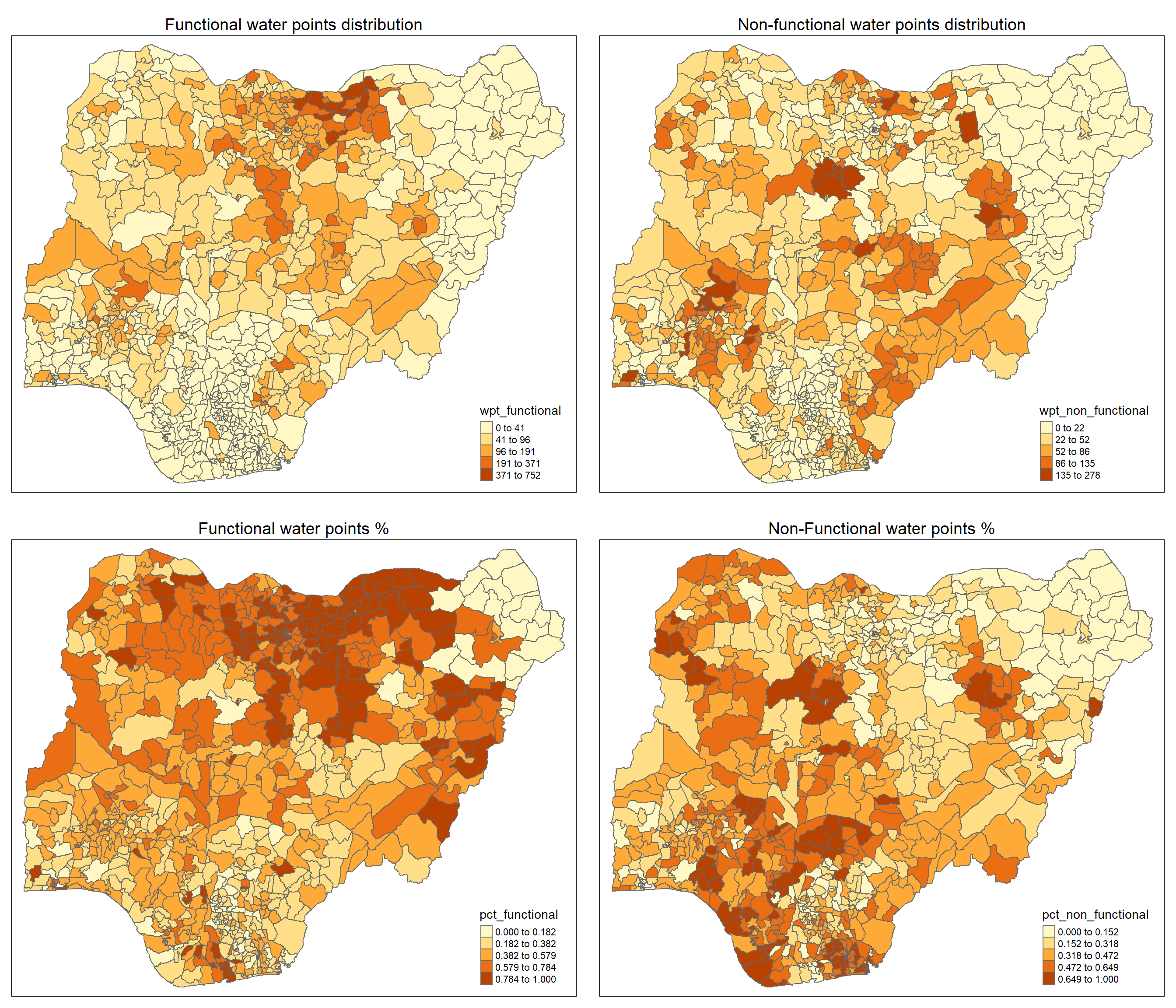
In the top left and top right plot, we have the absolute number of functional and non-functional water point. We can see a clear indication of patterns where certain cluster of regions have higher absolute value.
However, the magnitude of the variable does not tell the full story, thus we will also make a plot of the percentage of functional and non-functional water points in the lower left and right plots. From these two plots, we also notice a distinct pattern and clustering behavior of the variables.
Thus this is good evidence for us to look further.
Next we further turn our attention to the remaining variables:
hand_pump.map <- tm_shape(nga_wp) +
                  tm_fill(col = "pct_hand_pump",
                          n = 5,
                          style = "jenks",
                          title = "pct_hand_pump") +
                  tm_borders(alpha = 0.9) +
                  tm_layout(main.title = "Handpump % distribution",
                          main.title.position = "center",
                          main.title.size = 1.2,
                          legend.height = 0.6,
                          legend.width = 0.6,
                          frame = TRUE)

pct_1000.map <- tm_shape(nga_wp) +
                  tm_fill(col = "pct_1000",
                          n = 5,
                          style = "jenks",
                          title = "pct_1000") +
                  tm_borders(alpha = 0.9) +
                  tm_layout(main.title = "Capacity < 1000 % distribution",
                          main.title.position = "center",
                          main.title.size = 1.2,
                          legend.height = 0.6,
                          legend.width = 0.6,
                          frame = TRUE)

pct_rural.map <- tm_shape(nga_wp) +
                  tm_fill(col = "pct_rural",
                          n = 5,
                          style = "jenks",
                          title = "pct_rural") +
                  tm_borders(alpha = 0.9) +
                  tm_layout(main.title = "Rural % distribution",
                          main.title.position = "center",
                          main.title.size = 1.2,
                          legend.height = 0.6,
                          legend.width = 0.6,
                          frame = TRUE)

tmap_arrange(hand_pump.map, pct_1000.map, pct_rural.map,
             asp=NA, ncol=2)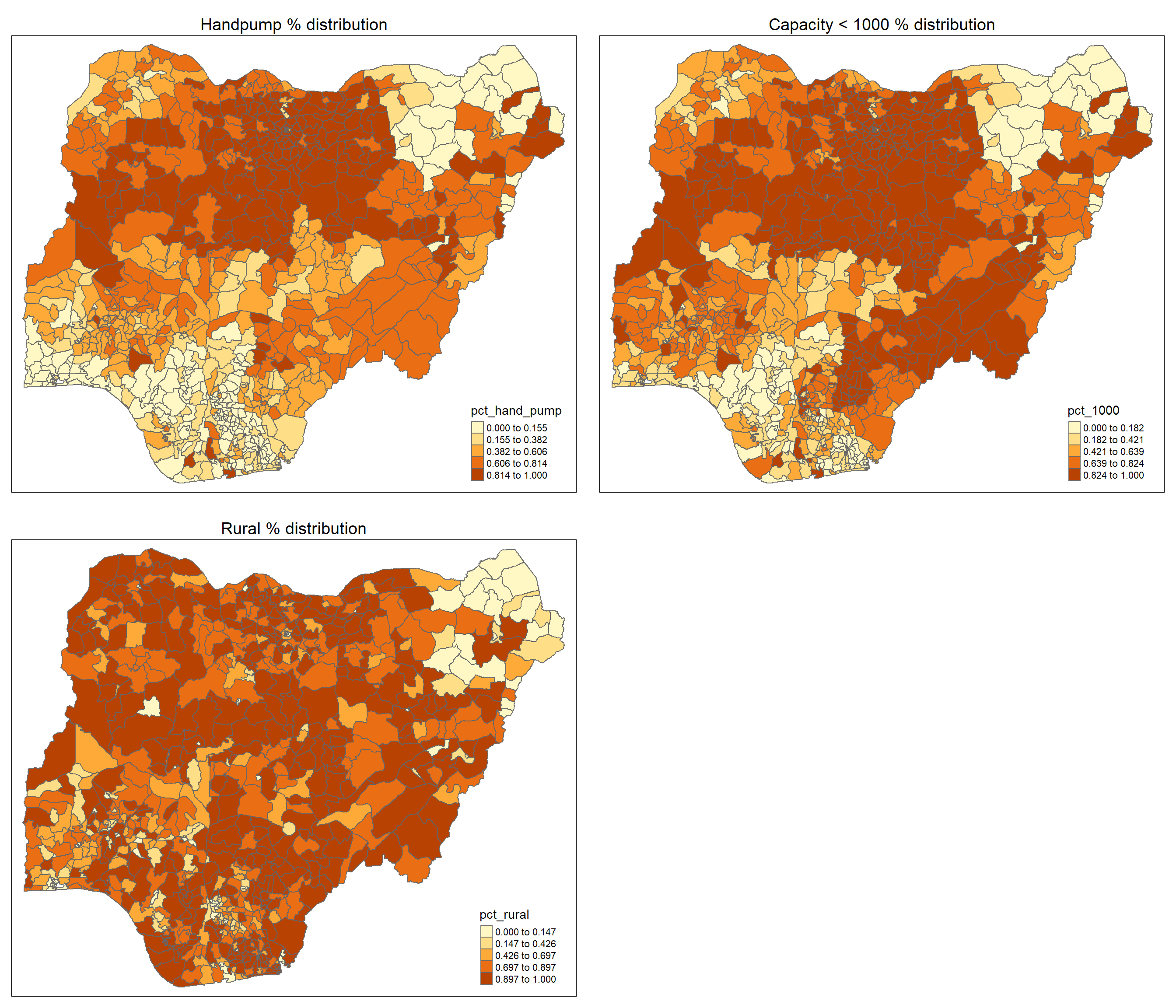
For the reaming variables, we observe clustering pattern for heat pump % and capacity < 1000 %. Interestingly, they seem to have similar spatial patterns which can suggest the possibility of correlation.
For the rural % however, the clustering pattern appears to be more fragmented.
Housekeeping:
rm(functional.map)
rm(non_functional.map)
rm(pct_functional.map)
rm(pct_non_functional.map)

rm(hand_pump.map)
rm(pct_1000.map)
rm(pct_rural.map)
Statistical
Next, we will make use of ggplot package to explore the distribution of values.
We will use geom_histogram() of the ggplot package to show the histogram of the variables:
wpt_functional <- ggplot(data=nga_wp,
             aes(x= `wpt_functional`)) +
            geom_histogram(bins=20,
                           color="black",
                           fill="light blue")+
            theme(axis.title=element_text(size=30,face="bold"))

wpt_non_functional <- ggplot(data=nga_wp,
             aes(x= `wpt_non_functional`)) +
            geom_histogram(bins=20,
                           color="black",
                           fill="light blue")+
            theme(axis.title=element_text(size=30,face="bold"))

pct_functional <- ggplot(data=nga_wp,
             aes(x= `pct_functional`)) +
            geom_histogram(bins=20,
                           color="black",
                           fill="light blue")+
            theme(axis.title=element_text(size=30,face="bold"))

pct_non_functional <- ggplot(data=nga_wp,
             aes(x= `pct_non_functional`)) +
            geom_histogram(bins=20,
                           color="black",
                           fill="light blue")+
            theme(axis.title=element_text(size=30,face="bold"))

ggarrange(wpt_functional, wpt_non_functional, pct_functional, pct_non_functional,
          ncol = 2,
          nrow = 2)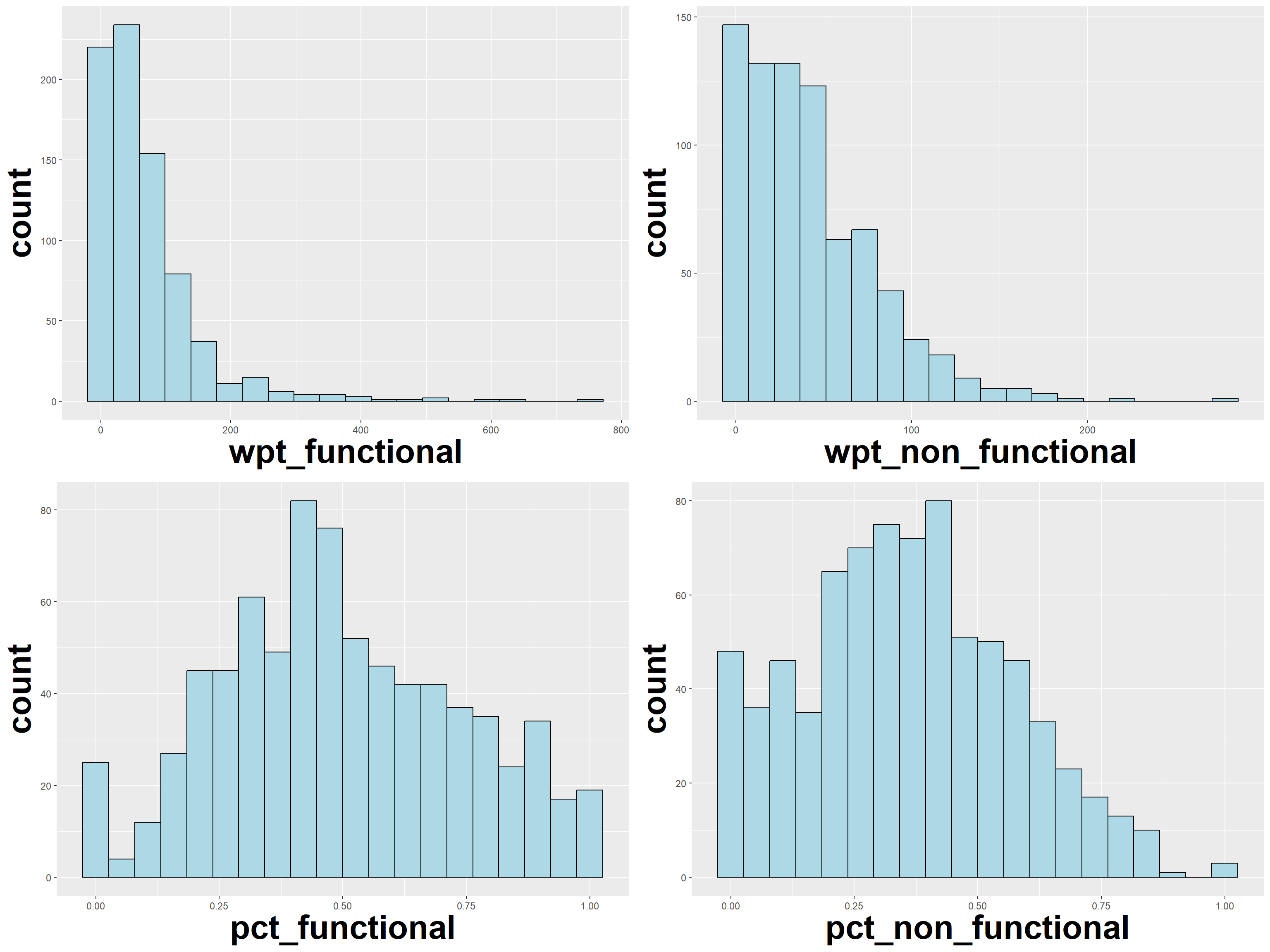
We can see that while this distribution of the functional and non-functional waterpoints are skewed, the % functional and % non-functional seems to follow a normal distribution.
We will use geom_histogram() of the ggplot package to show the histogram of remaining variables:
pct_handpump <- ggplot(data=nga_wp,
             aes(x= `pct_hand_pump`)) +
            geom_histogram(bins=20,
                           color="black",
                           fill="light blue")+
            theme(axis.title=element_text(size=30,face="bold"))

pct_1000 <- ggplot(data=nga_wp,
             aes(x= `pct_1000`)) +
            geom_histogram(bins=20,
                           color="black",
                           fill="light blue")+
            theme(axis.title=element_text(size=30,face="bold"))

pct_rural <- ggplot(data=nga_wp,
             aes(x= `pct_rural`)) +
            geom_histogram(bins=20,
                           color="black",
                           fill="light blue")+
            theme(axis.title=element_text(size=30,face="bold"))

ggarrange(pct_handpump, pct_1000, pct_rural,
          ncol = 2,
          nrow = 2)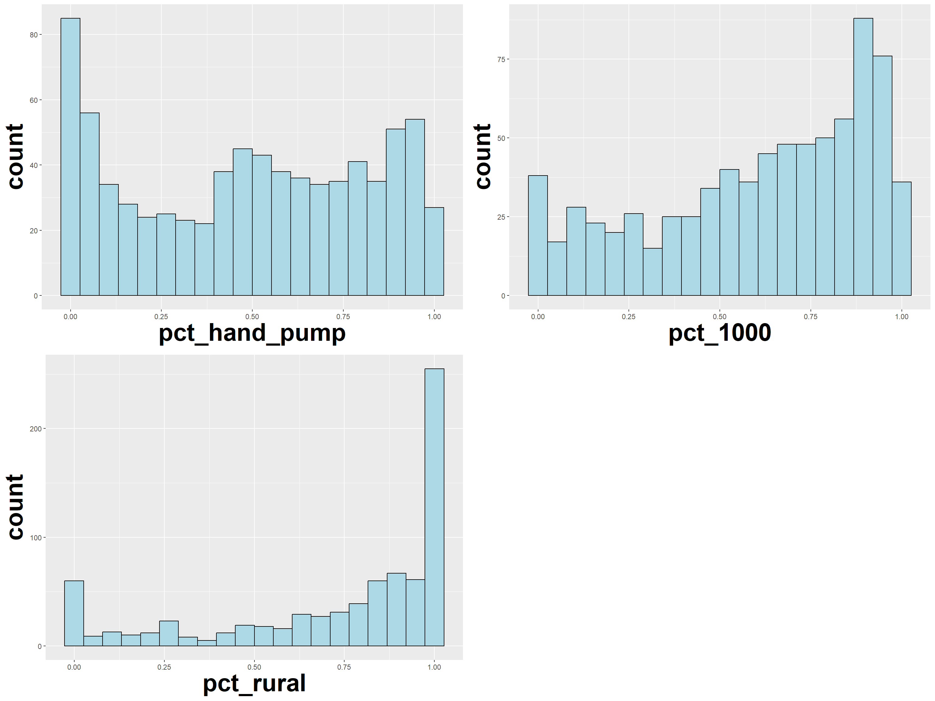
From the above plots, we observe a left skew in the distribution of regions with < 1000 capacity. We observe the same left skew for the distribution of rural waterpoints.
Housekeeping:
rm(wpt_functional)
rm(wpt_non_functional)
rm(pct_functional)
rm(pct_non_functional)

rm(hand_pump)
Warning in rm(hand_pump): object 'hand_pump' not foundrm(pct_1000)
rm(pct_rural)Step 6: Correlation Analysis
We will not get the correlation variables as follow:
(we use st_set_geometry(NULL) of sf package to exclude geometric data)
corr_data <- nga_wp[,c(4:5, 10:14)] %>% st_set_geometry(NULL)In order to perform correlation analysis, we need to get the correlation matrix using cor() from the base R package, then we can plot it using the corrplot.mixed() function from corrplot package.
Perform correlation analysis:
cluster_vars.cor = cor(corr_data)
corrplot.mixed(cluster_vars.cor,
         lower = "ellipse",
               upper = "number",
               tl.pos = "lt",
               diag = "l",
               tl.col = "black")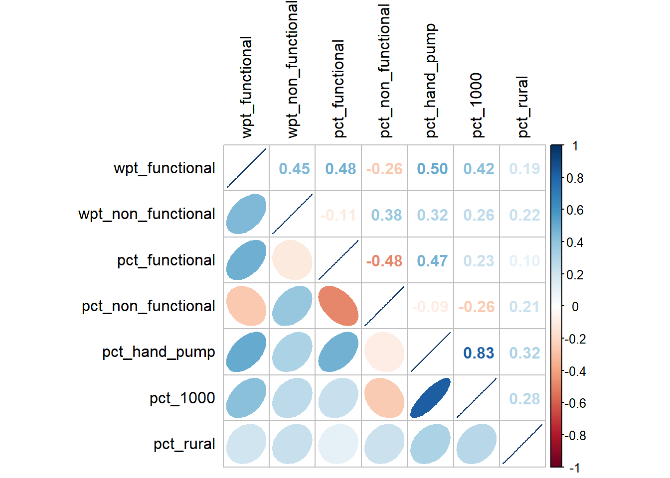
From the correlation plot above, we notice that pct_hand_pump is highly negatively correlated with pct_1000. Because the value is not that high extremely high, we always include it in the analysis at another time.
Perform cleanup:
rm(cluster_vars.cor)
rm(corr_data)
Step 7: Hierarchy Cluster Analysis
Extract the clustering variables
To perform the analysis, we need to extract the cluster variables without the geometric data. To do this, we we will use the function st_set_geometry(NULL) from sf package on our sf dataframe.
We run the code as follow:
cluster_vars <- nga_wp %>%
  st_set_geometry(NULL) %>%
  select("shapeName", "wpt_functional", "wpt_non_functional",
         "pct_functional", "pct_non_functional",
         "pct_hand_pump", "pct_1000", "pct_rural")
head(cluster_vars,3)
shapeName wpt_functional wpt_non_functional pct_functional pct_non_functional
1 Aba North 7 9 0.4117647 0.5294118
2 Aba South 29 35 0.4084507 0.4929577
3 Abadam 0 0 0.0000000 0.0000000
pct_hand_pump pct_1000 pct_rural
1 0.11764706 0.1764706 0.00000000
2 0.09859155 0.1267606 0.05633803
3 0.00000000 0.0000000 0.00000000Next, we need to change the row names using row.name() function from R base:
row.names(cluster_vars) <- cluster_vars$"shapeName"
head(cluster_vars,3)
shapeName wpt_functional wpt_non_functional pct_functional
Aba North Aba North 7 9 0.4117647
Aba South Aba South 29 35 0.4084507
Abadam Abadam 0 0 0.0000000
pct_non_functional pct_hand_pump pct_1000 pct_rural
Aba North 0.5294118 0.11764706 0.1764706 0.00000000
Aba South 0.4929577 0.09859155 0.1267606 0.05633803
Abadam 0.0000000 0.00000000 0.0000000 0.00000000Now, we do not need the column shapeName & pct_1000 anymore, so we exclude it:
cluster_vars <- select(cluster_vars, c(2:6, 8))
head(cluster_vars, 3)
wpt_functional wpt_non_functional pct_functional pct_non_functional
Aba North 7 9 0.4117647 0.5294118
Aba South 29 35 0.4084507 0.4929577
Abadam 0 0 0.0000000 0.0000000
pct_hand_pump pct_rural
Aba North 0.11764706 0.00000000
Aba South 0.09859155 0.05633803
Abadam 0.00000000 0.00000000Data Standardization
From our dataframe “done_cluster_vars”, we can see that the columns wpt_functional and wpt_non_functional have much higher ranges since they are counts instead of percentages. Thus we need to perform standardization on these columns. This is because analysis results will be biased towards clustering variables with large values. Hence the need for standardization before cluster analysis
We will therefore perform the min-max standardization using the normalize() of the heatmaply package:
(we use summary() of base R package to check the outcome)
std_cluster_vars <- normalize(cluster_vars)
summary(std_cluster_vars)
wpt_functional wpt_non_functional pct_functional pct_non_functional
Min. :0.00000 Min. :0.00000 Min. :0.0000 Min. :0.0000
1st Qu.:0.02261 1st Qu.:0.04406 1st Qu.:0.3261 1st Qu.:0.2105
Median :0.06051 Median :0.12230 Median :0.4741 Median :0.3505
Mean :0.08957 Mean :0.14962 Mean :0.4984 Mean :0.3592
3rd Qu.:0.11669 3rd Qu.:0.21853 3rd Qu.:0.6699 3rd Qu.:0.5076
Max. :1.00000 Max. :1.00000 Max. :1.0000 Max. :1.0000
pct_hand_pump pct_rural
Min. :0.0000 Min. :0.0000
1st Qu.:0.1670 1st Qu.:0.5727
Median :0.5099 Median :0.8645
Mean :0.4873 Mean :0.7271
3rd Qu.:0.7778 3rd Qu.:1.0000
Max. :1.0000 Max. :1.0000 Compute the proximity matrix
When calculating proximity matrix, there are a few options available for us:
-Euclidean
-Maximum
-Manhattan / City Block Distance
-Canberra
-Binary
-Minkowski
We will use Euclidean since it is the default.
Using the dist() of the base R package, we will compute the proximity matrix:
proxmat <- dist(std_cluster_vars, method = 'euclidean')Compute the Clustering
There are 2 forms of clustering methods:
Agglomerative-AGNES: This is a bottom up manner where each point starts as a cluster
Divise Analysis-DIANA: This is a top down approach. At each step, most heterogeneous is split.
There are a total of eight clustering algorithms for AGNES:
-ward.D
-ward.D2
-single
-complete
-average(UPGMA)
-mcquitty(WPGMA)
-median(WPGMC)
-centroid(UPGMC)
We will start off with “ward.D”
Using hclust() of the base R package, we will compute the cluster as follow:
hclust_ward <- hclust(proxmat, method = 'ward.D')We will then get an object hclust_ward which contains the detaiLED information on the structure of the cluster tree. This will allow the later plot() function to know how to plot the structure correctly.
Plotting the Dendrogram:
To view the outcome, we save the output as a png and then load it as a picture:
https://stackoverflow.com/questions/11444743/how-to-adjust-sizes-of-x-axis-in-dendrogram-r
Each time the code is run, the .png object will be updated. For better resolution, we increase the width and height of the .png file. The “cex” is adjusted such that the names of each region is just visible when we zoom in on the .png object.
Additional parameters:
lwd: Line width
main: Title
line: Position of title
cex.main: Size of title
We run the code as follow
png("plotdendogram.png",width=12800,height=3200)
plot(hclust_ward, cex = 1.2, lwd=3.0, main="Dendrogram", line = -20, cex.main=20)
Warning in graphics:::plotHclust(n1, merge, height, order(x$order), hang, :
"line" is not a graphical parameter
Warning in graphics:::plotHclust(n1, merge, height, order(x$order), hang, :
"line" is not a graphical parameterdev.off()png
2 Please open the png in a new tab and then zoom in:

Selecting the optimal clustering algorithm:
In order the measure the strength of the clustering structure, we will need to measure the agglomerative coefficient. If we compare the aforementioned coefficient across various clustering algorithms, we will be able to select the algorithm that gives us the best clustering structure.
The function agnes() functions similar to the hclust() function with the addition of a coefficient:
https://rdrr.io/cran/cluster/man/agnes.html
We now use the agnes() function from the cluster package:
agnes_result <- agnes(std_cluster_vars, method = "ward")
agnes_result$ac
[1] 0.990276The results are stored in the output data structure under the name agnes_result$ac. The higher the magnitude of this value, the better the clustering structure. In this case, “ward” gets a score of 0.990276 which shows strong clustering structure.
We will need to test all 4 of the clustering algorithms to determine which is the best to apply.
First, we need to create a data structure to hold the names of the clustering algorithms:
algorithms <- c( "average", "single", "complete", "ward")
names(algorithms) <- c( "average", "single", "complete", "ward")
algorithms
average single complete ward
"average" "single" "complete" "ward" Next we write a simple function “test” that takes in the name of the clustering algorithm and then outputs the score of the clustering structure:
test <- function(x) {
  agnes(std_cluster_vars, method = x)$ac
}
Finally, using the map_dbl() function from the purr package, we will map the name of each algorithm to the input of the functions:
map_dbl(algorithms, test) average single complete ward
0.9114067 0.7819154 0.9440637 0.9902760 Of the clustering algorithms, we can see that “ward” methods gives us the best clustering structure. Hence we will use this for the rest of the analysis.
We perform house keeping:
rm(cluster_vars)
rm(agnes_result)
rm(algorithms)
# rm(proxmat)
rm(test)
Determine optimal clusters
In order to perform meaningful analysis, we need to select the optimal amount of cluster. Too little clusters, we won’t be able to draw meaningful insights. Too many clusters, and we will also fail to draw meaning.
There are 3 methods to do this:
Elbow method
Average silhouette method
Gap statistic
For this, we will make use of the tool called the gap statistic:
https://hastie.su.domains/Papers/gap.pdf
The gap statistic is a measure of intra-cluster variation. The larger this value, the bigger the indication that the clustering behaviour is far from the random distribution of points. As we increase the number of cluster, we want to get a highest gap statistic number possible. The minimum number of clusters that we accept is 3 cluster for meaningful analysis.
There are a few methods to determine clusters:
firstSEmax
Tibs2001SEmax
globalSEmax
firstmax
globalmax
Useful links:
https://stats.stackexchange.com/questions/95290/how-should-i-interpret-gap-statistic
https://stat.ethz.ch/R-manual/R-devel/library/cluster/html/clusGap.html
To do this, we use the clusGap() function from the cluster package:
(for predictability, we need to set a specific random seed)
set.seed(2022)
gap_stat <- clusGap(std_cluster_vars,
                    FUN = hcut,
                    nstart = 25,
                    K.max = 25,
                    B = 50)
# Print the result
print(gap_stat, method = "Tibs2001SEmax")
Clustering Gap statistic ["clusGap"] from call:
clusGap(x = std_cluster_vars, FUNcluster = hcut, K.max = 25, B = 50, nstart = 25)
B=50 simulated reference sets, k = 1..25; spaceH0="scaledPCA"
--> Number of clusters (method 'Tibs2001SEmax', SE.factor=1): 4
logW E.logW gap SE.sim
[1,] 5.000512 5.537541 0.5370297 0.006640580
[2,] 4.838605 5.435522 0.5969167 0.010174498
[3,] 4.675903 5.364424 0.6885215 0.011084303
[4,] 4.585719 5.307609 0.7218895 0.010288092
[5,] 4.533596 5.262031 0.7284345 0.011096225
[6,] 4.487042 5.225343 0.7383019 0.010516894
[7,] 4.452088 5.193566 0.7414780 0.011305457
[8,] 4.411099 5.166658 0.7555587 0.010852306
[9,] 4.372379 5.144079 0.7717004 0.010651529
[10,] 4.342018 5.123315 0.7812978 0.009989005
[11,] 4.305545 5.104442 0.7988971 0.009588659
[12,] 4.274778 5.086947 0.8121689 0.009324876
[13,] 4.254300 5.070183 0.8158832 0.009123792
[14,] 4.228367 5.054393 0.8260260 0.009010597
[15,] 4.205874 5.039250 0.8333759 0.009009316
[16,] 4.184087 5.024765 0.8406782 0.009149193
[17,] 4.160961 5.010952 0.8499907 0.009199555
[18,] 4.136993 4.997904 0.8609109 0.009114803
[19,] 4.114595 4.985161 0.8705663 0.009126652
[20,] 4.095154 4.972999 0.8778457 0.009019012
[21,] 4.074534 4.961102 0.8865674 0.008938229
[22,] 4.058345 4.949750 0.8914045 0.008921074
[23,] 4.044721 4.938825 0.8941047 0.008809354
[24,] 4.026319 4.928110 0.9017906 0.008750836
[25,] 4.015433 4.917798 0.9023651 0.008647470Next, we will plot the Gap Statistics as follow:
fviz_gap_stat(gap_stat)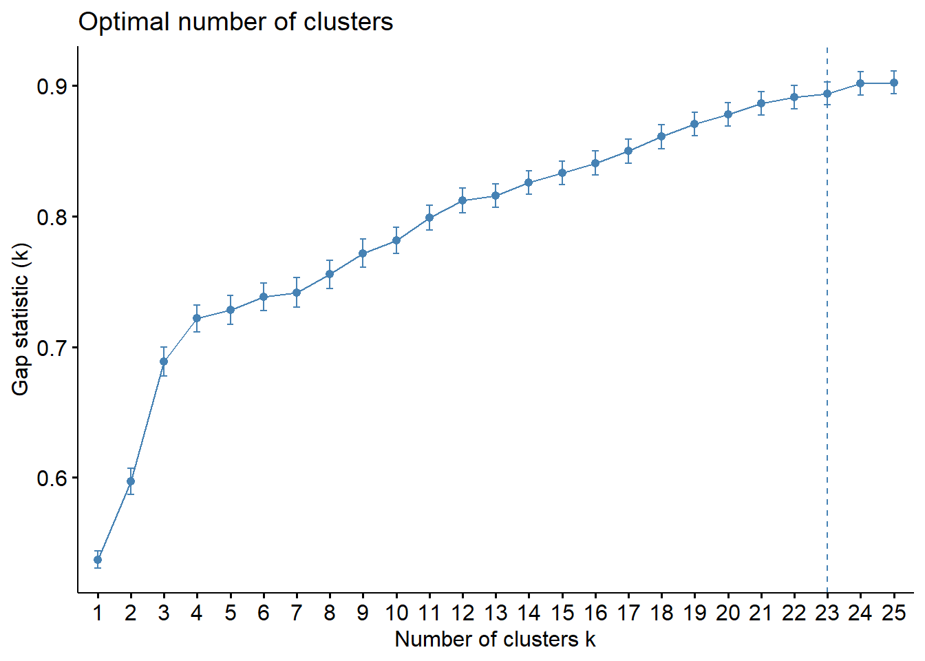
From the graph we see that the gradient of the Gap Statistic decreases greatly from the 4th cluster onwards. Therefore, we will opt to keep 5 clusters
Interpreting the Dendrograms
png("plotdendogram_0.png",width=12800,height=3200)
plot(hclust_ward, cex = 1.2, lwd=3.0, main="Dendrogram", line = -20, cex.main=20)
Warning in graphics:::plotHclust(n1, merge, height, order(x$order), hang, :
"line" is not a graphical parameter
Warning in graphics:::plotHclust(n1, merge, height, order(x$order), hang, :
"line" is not a graphical parameterrect.hclust(hclust_ward, k = 5, border = 2:5)
dev.off()png
2 To zoom in, right click and open picture on a new tab:

Visual Hierarchical clustering Analysis
In order to plot the heatmap, we need to convert the dataframe into a data matrix:
mat_std_cluster_vars <- data.matrix(std_cluster_vars)Next using heatmaply() of the heatmaply package, we can plot the interactive as follow:
heatmaply(mat_std_cluster_vars,
          Colv=NA,
          showticklabels = c(TRUE, FALSE),
          dist_method = "euclidean",
          hclust_method = "ward.D",
          seriate = "OLO",
          colors = Blues,
          k_row = 5,
          margins = c(NA,200,60,NA),
          fontsize_row = 4,
          fontsize_col = 5,
          main="ICT indicators",
          xlab = "ICT Indicators",
          ylab = "Nigeria LGA"
          )
Mapping the clusters
We first use the function cutree() of R base to prune the clusters to 5:
groups <- as.factor(cutree(hclust_ward, k=5))We will create a new sf dataframe nga_final which includes the geometry and the variables:
nga_final <- nga_wp %>%
  select("shapeName", "wpt_functional", "wpt_non_functional",
         "pct_functional", "pct_non_functional",
         "pct_hand_pump", "pct_1000", "pct_rural")
Next, we will use cbind() from base R to save the clustering group as a column:
bind_std_cluster_vars <- cbind(nga_final, as.matrix(groups)) %>%
  rename(`CLUSTER`=`as.matrix.groups.`)
Here we will do a simple filtering to allow us to get the group number of a specific region
bind_std_cluster_vars %>% filter(shapeName == "Kanke")Simple feature collection with 1 feature and 9 fields
Geometry type: MULTIPOLYGON
Dimension: XY
Bounding box: xmin: 776977.8 ymin: 576111.2 xmax: 812592.4 ymax: 616431.6
Projected CRS: Minna / Nigeria West Belt
shapeName wpt_functional wpt_non_functional pct_functional pct_non_functional
1 Kanke 217 89 0.484375 0.1986607
pct_hand_pump pct_1000 pct_rural CLUSTER geometry
1 0.6160714 0.9330357 1 2 MULTIPOLYGON (((779281.4 61...Using qtm() of the tmap, we will perform a quick plot as follow:
tmap_mode("plot")tmap mode set to plottingtm_shape(bind_std_cluster_vars) +
tm_fill("CLUSTER") +
tm_borders(alpha = 0.9) +
tm_compass(type="8star", size = 2) +
tm_scale_bar() +
tm_grid(alpha =0.2) +
tm_layout(main.title = "Cluster Distribution of Nigeria",
main.title.position = "center",
main.title.size = 1.2,
legend.height = 0.45,
legend.width = 0.35,
frame = TRUE) 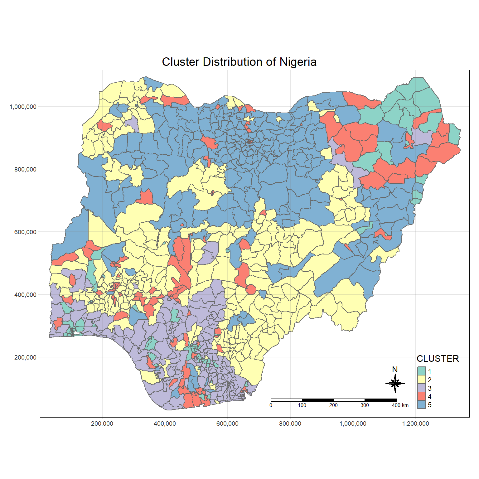
From the above plot, we can see that if we do clustering without consideration for geographic location, we get a cluster map that has clusters that are highly fragmented.
Housekeeping to remove variables from environment:
rm(gap_stat)
rm(hclust_ward)
rm(mat_std_cluster_vars)
rm(groups)
Step 8: SKATER
Unconstrained clustering often will show some form of regional clustering, but if we want all members of the clusters to show spatially contiguous relationships, we need specialized algorithm such as SKATER.
A key idea here is that traditional cluster valuation measures is sub-optimal in practice because of real-world constraints. As shown from the unconstrained cluster evaluation above, our clusters turned out to be quite fragmented.
Thus, the advantage of using SKATER is that it provides a hard requirement that spatial objects in the same cluster are also geographically linked. It is a rationalization approach using graph partitioning while preserving neighborhood connectivity.
Additional Info for SKATER:
https://www.dshkol.com/post/spatially-constrained-clustering-and-regionalization/
Check for regions without neighbors:
Using the summary function, we will check if all polygons have a neighbor:
summary(poly2nb(nga))Neighbour list object:
Number of regions: 774
Number of nonzero links: 4440
Percentage nonzero weights: 0.7411414
Average number of links: 5.736434
1 region with no links:
86
Link number distribution:
0 1 2 3 4 5 6 7 8 9 10 11 12 14
1 2 14 57 125 182 140 122 72 41 12 4 1 1
2 least connected regions:
138 560 with 1 link
1 most connected region:
508 with 14 linksIt appears that polygon from row 86 does not have a neighbor:
poly2nb(nga)[86][[1]]
[1] 0Remove regions without neighbors:
We remove row 86 from boundary file:
nga <- nga[c(1:85, 87:774),]We do the same for the clustering variables:
bind_std_cluster_vars <- bind_std_cluster_vars[c(1:85, 87:774),]
nga_wp <- nga_wp[c(1:85, 87:774),]
std_cluster_vars <- std_cluster_vars[c(1:85, 87:774),]
nga_final <- nga_final[c(1:85, 87:774),]
Compute the neighbors and the cost:
Neighbor
We will convert the boundary file to a spatial file and then feed it to the function poly2nb():
nga_sp <- as_Spatial(nga)
nga.nb <- poly2nb(nga_sp)
summary(nga.nb)
Neighbour list object:
Number of regions: 773
Number of nonzero links: 4440
Percentage nonzero weights: 0.7430602
Average number of links: 5.743855
Link number distribution:
1 2 3 4 5 6 7 8 9 10 11 12 14
2 14 57 125 182 140 122 72 41 12 4 1 1
2 least connected regions:
138 560 with 1 link
1 most connected region:
508 with 14 linksWe can then plot the neighbor relationship:
plot(nga_sp,
border=grey(.5), main="Neighbor Map", cex.main=4)
plot(nga.nb,
coordinates(nga_sp),
col="blue",
add=TRUE)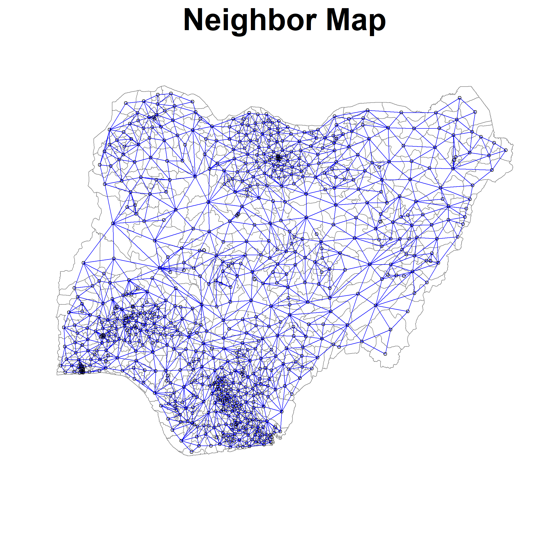
Edge cost and weights
Next we will use the neighbor list and the clustering variables to compute the edge cost
using nbcosts() of spdep package:
lcosts <- nbcosts(nga.nb, std_cluster_vars)Next we need to construct the weights taking into account the edge cost and the neighbors:
(We need to use “B” for binary here since we want the edge cost)
nga.w <- nb2listw(nga.nb,
lcosts,
style="B")Warning in nb2listw(nga.nb, lcosts, style = "B"): zero sum general weightssummary(nga.w)Characteristics of weights list object:
Neighbour list object:
Number of regions: 773
Number of nonzero links: 4440
Percentage nonzero weights: 0.7430602
Average number of links: 5.743855
Link number distribution:

  1   2   3   4   5   6   7   8   9  10  11  12  14
  2  14  57 125 182 140 122  72  41  12   4   1   1
2 least connected regions:
138 560 with 1 link
1 most connected region:
508 with 14 links
Weights style: B
Weights constants summary:
n nn S0 S1 S2
B 773 597529 2109.869 2666.155 28614.43Construct Minimum Spanning Tree
Now, using mstree() of the spdep package, we will construct the minimum spanning tree:
nga.mst <- mstree(nga.w)We now check the class:
class(nga.mst)[1] "mst" "matrix"We also check the dimension:
dim(nga.mst)[1] 772 3We can check the contents of the minimum spanning tree:
head(nga.mst) [,1] [,2] [,3]
[1,] 296 49 0.2877620
[2,] 296 325 0.3152240
[3,] 325 622 0.1296126
[4,] 622 514 0.1773219
[5,] 514 461 0.1267727
[6,] 514 681 0.1891041Finally we can plot the minimum spanning tree as follow:
(We will set the size of label to be small so we can see the tree)
plot(nga_sp, border=gray(.5), main="Minimum Spanning Tree", cex.main=4)
plot.mst(nga.mst,
         coordinates(nga_sp),
         col="blue",
         cex.lab=0.1,
         cex.circles=0.005,
         add=TRUE)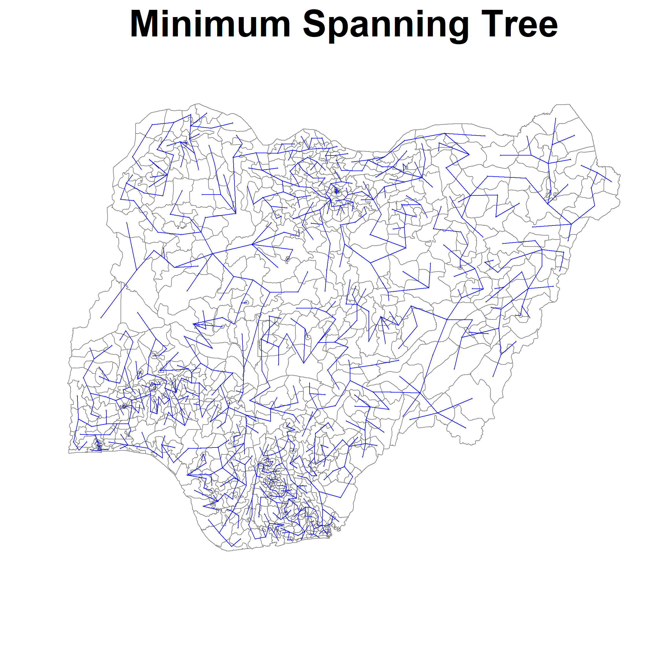
Housekeeping
rm(lcosts)
rm(nga.w)
rm(nga.nb)
Compute Spatially constrained clusters with SKATER method
Now that we have the minimum spanning tree, we can then compute the spatially constrained cluster using the skater() package of spdep. We will be needing the minimum spanning tree computed earlier as well as the standardized cluster variables.
Note: the number of cuts is not equal to the number of clusters. For cluster 5, the number of cuts required is actually 4.
We run the code as follow:
clust5 <- spdep::skater(edges = nga.mst[,1:2],
                 data = std_cluster_vars,
                 method = "euclidean",
                 ncuts = 4)
ccs5 <- clust5$groupsNext we will plot our the lines for each individual cluster:
plot(nga_sp, border=gray(.1), main="SKATER Clusters", cex.main=4)
plot(clust5,
     coordinates(nga_sp),
     cex.lab=0.1,
     groups.colors=c("red","green","blue", "brown", "black"),
     cex.circles=0.005, lwd=3.0,
     add=TRUE)
Warning in segments(coords[id1, 1], coords[id1, 2], coords[id2, 1],
coords[id2, : "add" is not a graphical parameter
Warning in segments(coords[id1, 1], coords[id1, 2], coords[id2, 1],
coords[id2, : "add" is not a graphical parameter
Warning in segments(coords[id1, 1], coords[id1, 2], coords[id2, 1],
coords[id2, : "add" is not a graphical parameter
Warning in segments(coords[id1, 1], coords[id1, 2], coords[id2, 1],
coords[id2, : "add" is not a graphical parameter
Warning in segments(coords[id1, 1], coords[id1, 2], coords[id2, 1],
coords[id2, : "add" is not a graphical parameter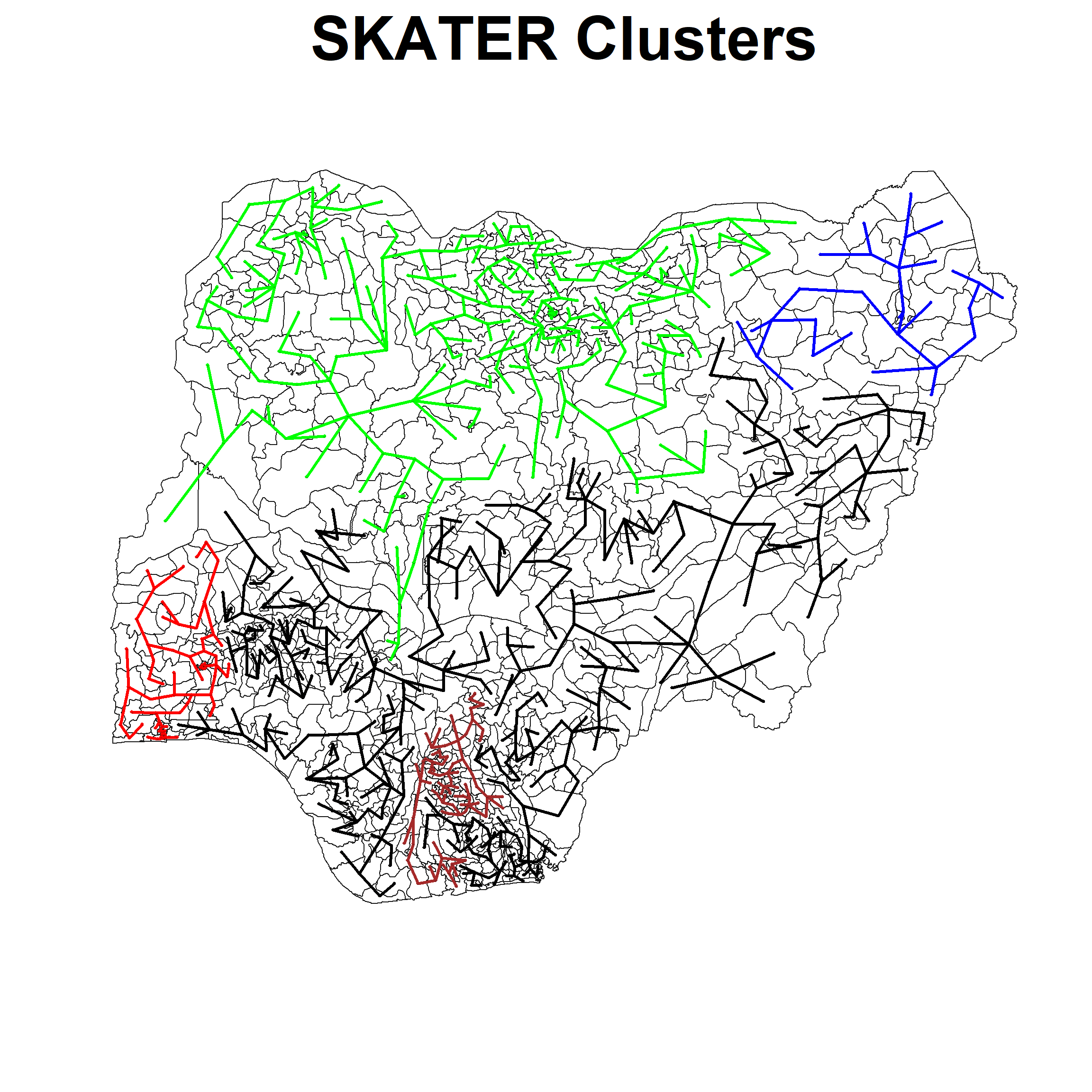
Lastly we can visualize our outcome with qtm() of the tmap:
groups_mat <- as.matrix(clust5$groups)
nga_sf_spatialcluster <- cbind(nga_final, as.factor(groups_mat)) %>%
    rename(`SP_CLUSTER`=`as.factor.groups_mat.`)

tm_shape(nga_sf_spatialcluster) +
  tm_fill("SP_CLUSTER") +
  tm_borders(alpha = 0.9) +
  tm_compass(type="8star", size = 2) +
  tm_scale_bar() +
  tm_grid(alpha =0.2) +
  tm_layout(main.title = "Cluster Distribution of Nigeria",
            main.title.position = "center",
            main.title.size = 1.2,
            legend.height = 0.45,
            legend.width = 0.35,
frame = TRUE) 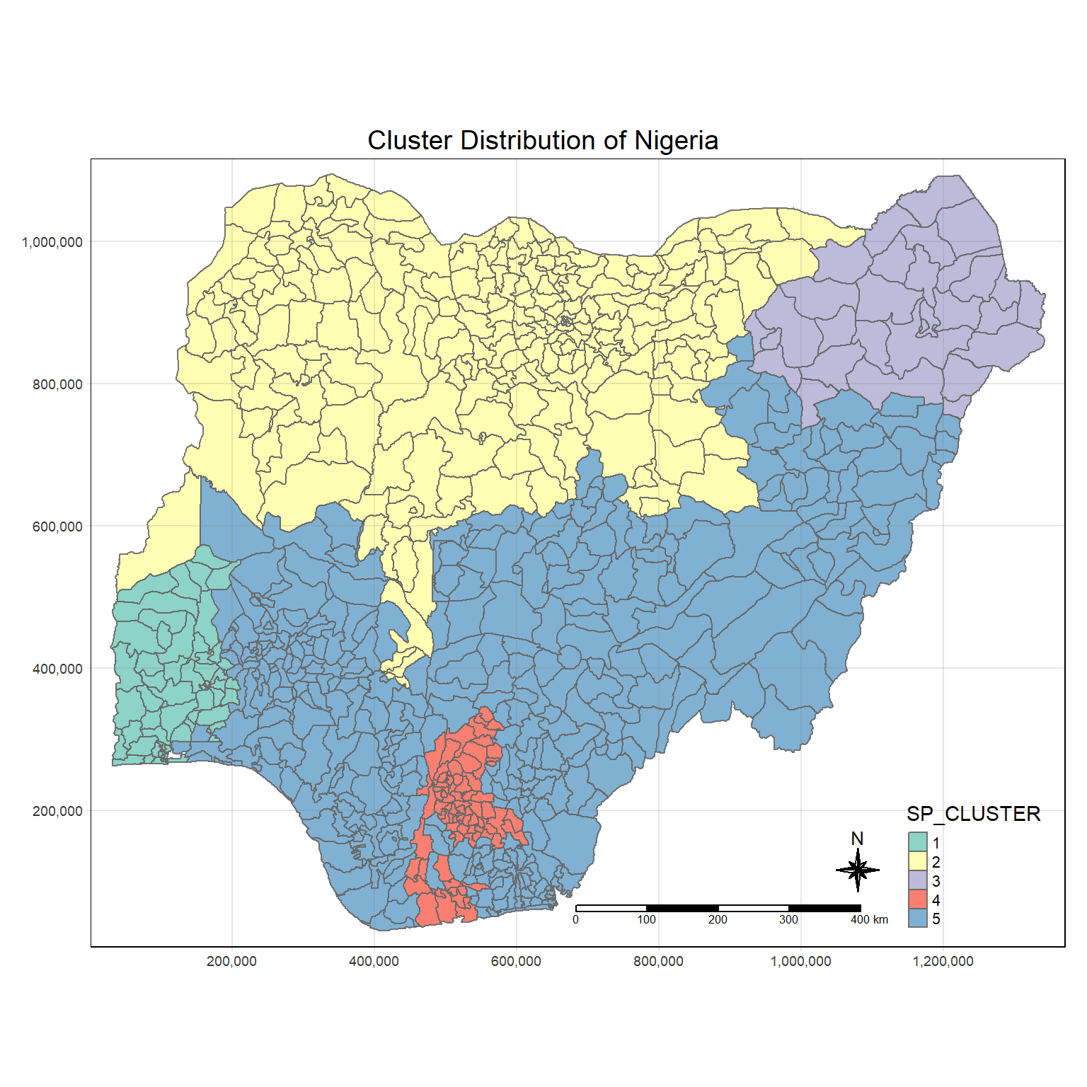
After applying the SKATER method, we not see that the clusters becomes much less fragmented. as compared to earlier.
We can easily compare the difference using tmap_arrange() from the tmap package:
tmap_mode("plot")tmap mode set to plottingnormal_cluster.map <- tm_shape(bind_std_cluster_vars) +
tm_fill("CLUSTER") +
tm_borders(alpha = 1.0) +
tm_compass(type="8star", size = 2) +
tm_scale_bar() +
tm_grid(alpha =0.2) +
tm_layout(main.title = "Cluster Distribution of Nigeria",
main.title.position = "center",
main.title.size = 1.2,
legend.height = 0.45,
legend.width = 0.35,
frame = TRUE)
skater_cluster.map <- tm_shape(nga_sf_spatialcluster) +
tm_fill("SP_CLUSTER") +
tm_borders(alpha = 1.0) +
tm_compass(type="8star", size = 2) +
tm_scale_bar() +
tm_grid(alpha =0.2) +
tm_layout(main.title = "SKATER Distribution of Nigeria",
main.title.position = "center",
main.title.size = 1.2,
legend.height = 0.45,
legend.width = 0.35,
frame = TRUE)
tmap_arrange(normal_cluster.map, skater_cluster.map,
asp=NA, ncol=2)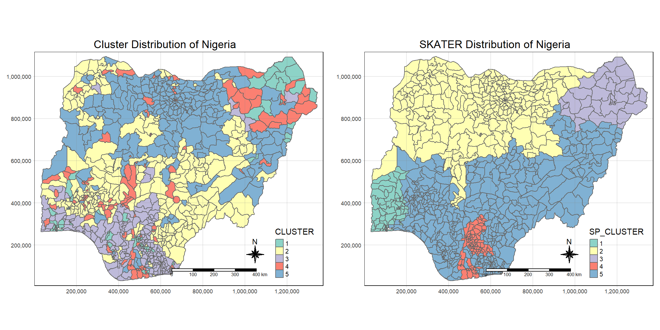
Housekeeping
rm(clust5)
rm(groups_mat)
rm(normal_cluster.map)
# rm(skater_cluster.map)
Step 9: Spatially Constrained Method with ClustGeo
ClustGeo is a useful package that allows us to mix and find the best balance between maintaining spatial contiguity and the solution based on the variable of interest. All this is controlled by the mixing variable alpha.
There are 2 matrix D0 & D1 that is involved:
-D0: This matrix represents the dissimilarities in the attribute/clustering variable space.
-D1: This matrix represents the dissimilarities in the spatial domain.
Our goal is thus to find a good balance between this 2 matrix using the alpha variable.
Traditional Ward-Like clustering with ClustGeo
ClustGeo also offers a non-spatially constrained clustering with hclustgeo() as follow:
non_geo_cluster <- hclustgeo(proxmat)

png("plotdendogram_1.png",width=12800,height=3200)
plot(non_geo_cluster, cex = 1.2, lwd=3.0, main="Dendrogram",
     line = -20, cex.main=20)
Warning in graphics:::plotHclust(n1, merge, height, order(x$order), hang, :
"line" is not a graphical parameter
Warning in graphics:::plotHclust(n1, merge, height, order(x$order), hang, :
"line" is not a graphical parameterrect.hclust(non_geo_cluster, k = 5, border = 2:5)
dev.off()png
2 
Housekeeping:
rm(non_geo_cluster) Preparing Spatially Constrained Hierarchical Clustering
To perform the clustering, we need 3 ingredients:
-Distance Matrix: Represents the spatial domain
-Proximity Matrix: Represents the variable domain
-Mixing variable Alpha: This is required for denoting the degree of mix
Distance Matrix
We will use st_distance() of the sf package to compute the distance matrix:
dist <- st_distance(nga_final, nga_final)
distmat <- as.dist(dist)
Proximity Matrix
Same as earlier, we will use dist() of the base R package to compute the variable proximity matrix:
proxmat <- dist(std_cluster_vars, method = 'euclidean')Mixing Variable Alpha
Using the above 2 ingredients, we can now get the third ingredient.
We use the function choicealpha() from the ClustGeo package as follow:
cr <- choicealpha(proxmat, distmat, range.alpha = seq(0, 1, 0.1), K=6,
                  graph = TRUE)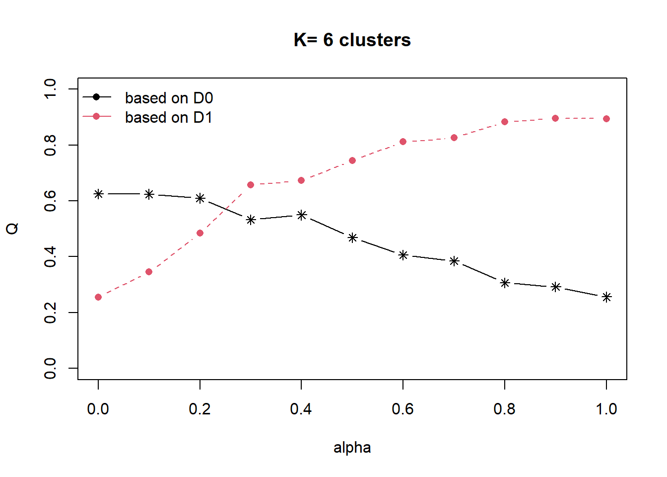
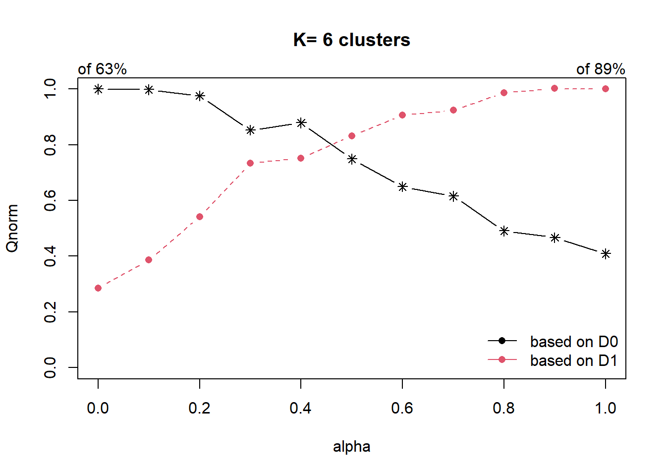
From the graph plotted, we observe that the optimal Qnorm value is at 0.5, we will now use this as the mixing variable.
Spatially Constrained Hierarchical Clustering
Once the mixing variable has been determined, we can then compute the clusters using hclustgeo():
clustG <- hclustgeo(proxmat, distmat, alpha = 0.5)Now that the clusters have been calculated, we will then use cutree() to limit number of clusters to 5:
groups <- as.factor(cutree(clustG, k=5))We will then append the cluster ID of each region to the nga_final dataframe and save as a new sf:
nga_sf_Gcluster <- cbind(nga_final, as.matrix(groups)) %>%
                  rename(`CLUSTER` = `as.matrix.groups.`)
clustgeo_cluster.map <- tm_shape(nga_sf_Gcluster) +
tm_fill("CLUSTER") +
tm_borders(alpha = 1.0) +
tm_compass(type="8star", size = 2) +
tm_scale_bar() +
tm_grid(alpha =0.2) +
tm_layout(main.title = "ClustGeo Distribution of Nigeria",
main.title.position = "center",
main.title.size = 1.2,
legend.height = 0.45,
legend.width = 0.35,
frame = TRUE)
clustgeo_cluster.map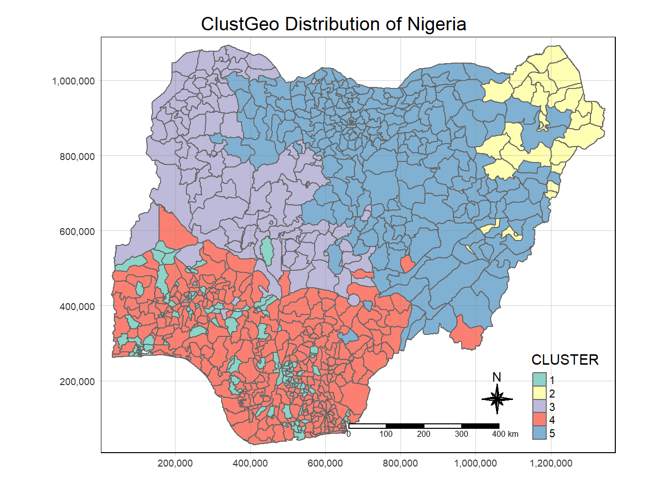
Using tmap_arrange(), we will do a comparison:
tmap_arrange(skater_cluster.map, clustgeo_cluster.map,
             asp=NA, ncol=2)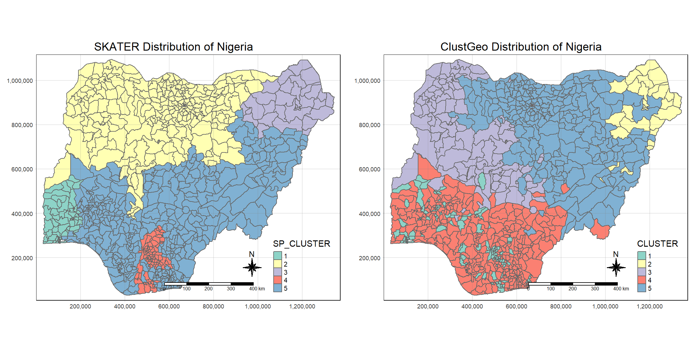
Comparing the SKATER and the clustGeo, we see that clustGeo is less strict on geographical relationship.
Step 10: Interpreting our results
Using ggarrange(), we will combine multiple box plots:
wpt_functional <- ggplot(data = nga_sf_Gcluster,
               aes(x = CLUSTER, y = wpt_functional)) +
               geom_boxplot()+
               theme(axis.title=element_text(size=6,face="bold"))

wpt_non_functional <- ggplot(data = nga_sf_Gcluster,
               aes(x = CLUSTER, y = wpt_non_functional)) +
               geom_boxplot()+
               theme(axis.title=element_text(size=6,face="bold"))

pct_functional <- ggplot(data = nga_sf_Gcluster,
               aes(x = CLUSTER, y = pct_functional)) +
               geom_boxplot()+
               theme(axis.title=element_text(size=6,face="bold"))

pct_non_functional <- ggplot(data = nga_sf_Gcluster,
               aes(x = CLUSTER, y = pct_non_functional)) +
               geom_boxplot()+
               theme(axis.title=element_text(size=6,face="bold"))

pct_hand_pump <- ggplot(data = nga_sf_Gcluster,
               aes(x = CLUSTER, y = pct_hand_pump)) +
               geom_boxplot()+
               theme(axis.title=element_text(size=6,face="bold"))

pct_rural <- ggplot(data = nga_sf_Gcluster,
               aes(x = CLUSTER, y = pct_rural)) +
               geom_boxplot()+
               theme(axis.title=element_text(size=6,face="bold"))

ggarrange(wpt_functional, wpt_non_functional, pct_functional, pct_non_functional,
          pct_hand_pump, pct_rural,
          ncol = 2,
          nrow = 3)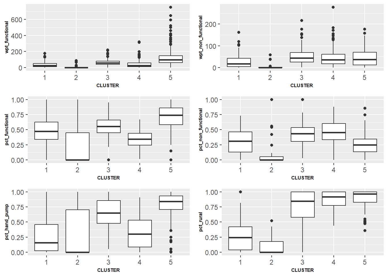
The above box plots tells us the the presence of each variable inside each cluster. We are able to make the following observations:
Cluster 5 contains the regions with higher number of working water points (Plot wpt_functional)
Cluster 5 contains regions with higher percentage of working water points (Plot pct_functional)
Cluster 1, 2 & 4 have lower number of hand pump water points (Plot pct_hand_pump)
Cluster 3, 4 & 5 consist more of rural water points
We will need to normalize the wpt_functional & wpt_non_functional again since values are counts:
nga_sf_Gcluster$wpt_functional <- normalize(nga_sf_Gcluster$wpt_functional)
nga_sf_Gcluster$wpt_non_functional <- normalize(nga_sf_Gcluster$wpt_non_functional)
Using multi-variate visualization, we can try to explain the characteristic of each cluster:
ggparcoord(data = nga_sf_Gcluster,
           columns = c(2:6,8),
           scale = "globalminmax",
           alphaLines = 0.2,
           boxplot = TRUE,
           title = "Multiple Parallel Coordinates Plots of ICT Variables by Cluster") +
  facet_grid(rows = vars(CLUSTER)) +
  theme(axis.text.x = element_text(angle = 10))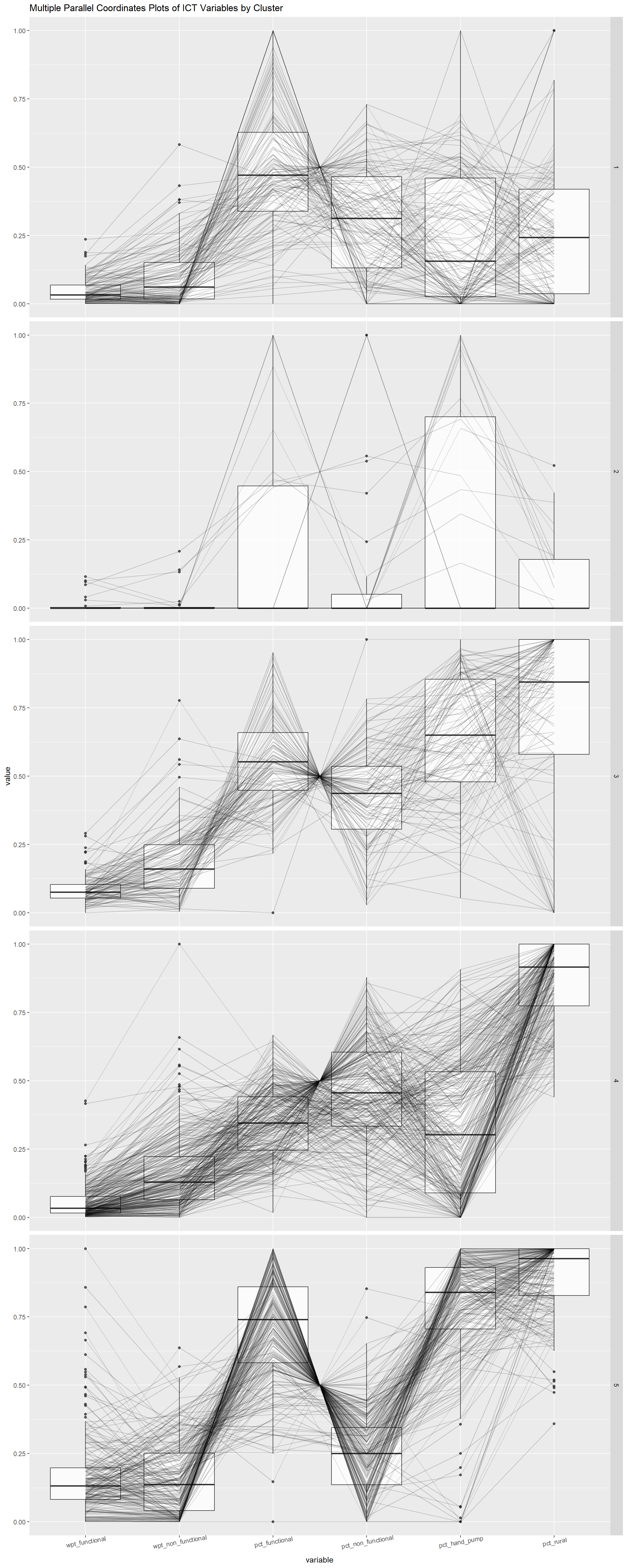
From the above, we can derive further the characteristic if each cluster:
Cluster 1:Majority non-rural water points what seem to be in good working condition
Cluster 2: Majority non-rural water points
Cluster 3: Mostly Rural water points which are mostly in good working condition which uses hand pump technology.
Cluster 4: Highly Rural waterpoints which less numbers in working condition and most of them are not hand pump technology.
Cluster 5: Highly Rural water points which are majority in good working condition which uses hand pump technology.
Finally, we can compute our summary statistics as follow:
nga_sf_Gcluster %>%
  st_set_geometry(NULL) %>%
  group_by(CLUSTER) %>%
  summarise(wpt_functional = mean(wpt_functional),
            wpt_non_functional = mean(wpt_non_functional),
            pct_functional = mean(pct_functional),
            pct_non_functional = mean(pct_non_functional),
            pct_hand_pump = mean(pct_hand_pump),
            pct_rural = mean(pct_rural))
# A tibble: 5 × 7
CLUSTER wpt_functional wpt_non_functional pct_functi…¹ pct_n…² pct_h…³ pct_r…⁴
<chr> <dbl> <dbl> <dbl> <dbl> <dbl> <dbl>
1 1 0.0478 0.0998 0.492 0.305 0.235 0.263
2 2 0.0172 0.0193 0.193 0.139 0.325 0.102
3 3 0.0865 0.183 0.555 0.421 0.646 0.716
4 4 0.0544 0.164 0.349 0.465 0.330 0.869
5 5 0.169 0.161 0.704 0.255 0.774 0.901
# … with abbreviated variable names ¹pct_functional, ²pct_non_functional,
# ³pct_hand_pump, ⁴pct_ruralFrom our summary statistic, we can see that the mean values for each role matches our description from the multivariate visualization greatly.